YouTube Data Visualization
Analysis and visualization of my YouTube consumption with PowerBI and Python.
The project
Over the past few months my YouTube consumption has evolved quite a bit. Shorts entered my daily rotation even though I used to avoid them, and that piqued my curiosity pretty fast. So that small curiosity pushed me to analyze my viewing habits to better understand them, especially to check if I was really watching as many Shorts as I felt I was.
The data
I pulled my complete history via Google Takeout, then built a PowerBI app to visualize the consumption data. The idea was to have something interactive, so I could dig as follow-up questions came up.
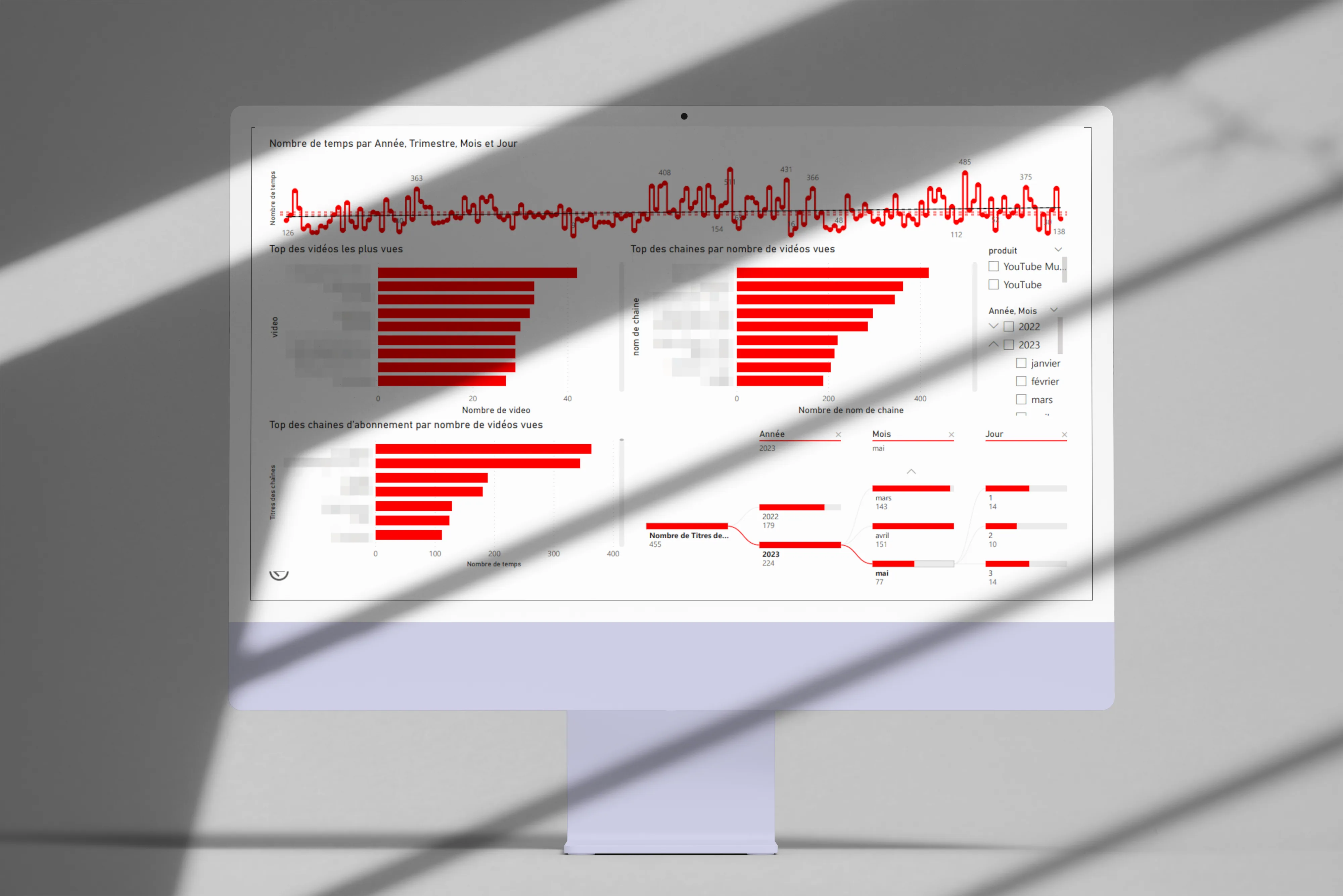
First visualizations
Here are the angles I explored first:
-
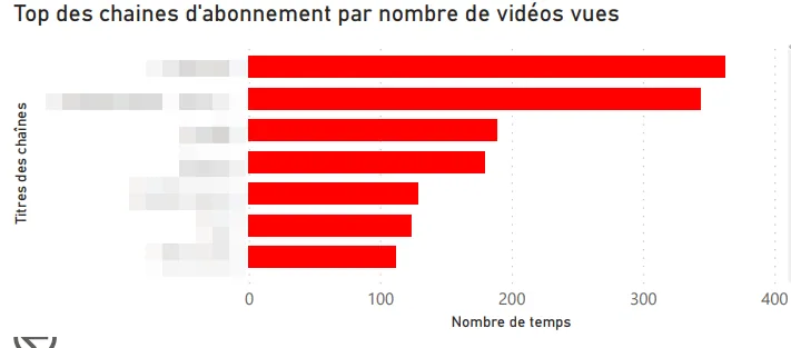
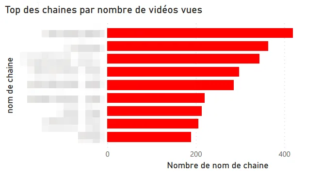
Top channels by videos watched.
-
Top channels I’m subscribed to.
-
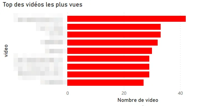
Most-watched videos.
-
Time split (year, quarter, month, day).
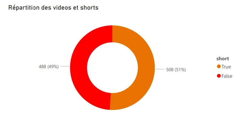
Shorts vs classic videos
First catch: YouTube doesn’t distinguish Shorts from regular videos in the exported data. Digging, I found that Shorts URLs contain a /shorts/[id] path, which let me identify them and build a dedicated split visualization. Not the most elegant technique, but it does the job.
Other visualizations
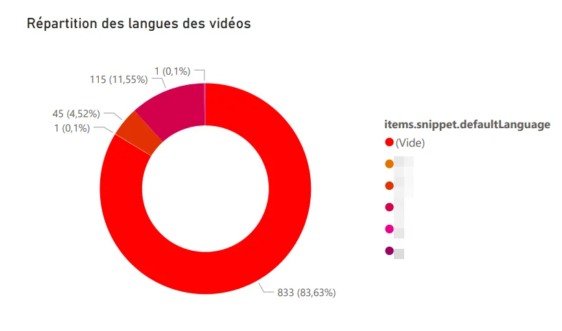
Language distribution. Reusing the logic from my Any%English project, I identified the language of each watched video: French, English, German, Japanese (probably the Shorts, by the way).
Word cloud. Generated from the descriptions of watched videos, it surfaces my recurring themes: music, video games, travel. Nothing very surprising, but still nice to have it quantified.
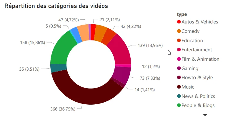
Top categories watched. Music, video games, and entertainment lead the pack.
Motivations
This project answered a real personal question about my digital habits, and at the same time it let me level up on PowerBI, which I knew less well than Tableau Software. A double benefit, which is always pleasant on a personal project.
Tech stack
-
PowerBI
-
Python
-
YouTube Data API v3