Tom LEFRERE · Data Scientist & AI Project Lead
Raw data.
A signal.
Data Scientist at the French Ministry of Defence. I turn complex datasets into readable decisions, modelling, explainability, applied AI.
WorkPortfolio · 28 projects
Every line of code
tells a story.
Data, web, experiments. Click a card to open the project without leaving the page.
Reset Pack, reinstalling Windows in a single command
tom-lefrere.fr, my personal site across four lives
Esport Stats, a small data investigation on pro scenes
Manim Animations
Answer, RAG visualization on documents
BestPick, a champion recommender for LoL
Discord Recap, my own annual wrap, my way

Divine Simulation, AIs playing gods in WorldBox
Home Assistant × Claude, home automation supercharged by AI
How Am I Lucky, a data visualization of luck
LoL Predict, match prediction via ML
Mathelearning, a math-learning platform
Programme Maire, a compatibility quiz for municipal elections
YouTube Data Visualization
Conscious, an anti-food-waste web app
Opinion Mining, sentiment analysis on text

Legermain, a showcase site for a craftsman

GetSubscribedChannels, a YouTube channels exporter

Any%English, how much of my YouTube is in English?
DofusClassSelector, a ladder analysis for Dofus
LunaSleep, does the moon affect my sleep quality?
Big4Craft, a last-minute Minecraft tournament site
Université Populaire de l'Indre, an online course platform
ExamApp, university exam scheduling
Overbet, friendly bets on Overwatch esport
Domopack, a connected-home configurator
GesPatApp, managing a health center in Java
DreamTeam, a final-year project logbook
- 01
Reset Pack, reinstalling Windows in a single command
Active 2026 - 02
tom-lefrere.fr, my personal site across four lives
Active 2026 - 03
Esport Stats, a small data investigation on pro scenes
Done 2026 - 04
Manim Animations
Done 2026 - 05
Answer, RAG visualization on documents
Done 2026 - 06
BestPick, a champion recommender for LoL
Done 2026 - 07
Discord Recap, my own annual wrap, my way
Done 2026 - 08
Divine Simulation, AIs playing gods in WorldBox
Active 2026 - 09
Home Assistant × Claude, home automation supercharged by AI
Done 2026 - 10
How Am I Lucky, a data visualization of luck
Active 2026 - 11
LoL Predict, match prediction via ML
Done 2026 - 12
Mathelearning, a math-learning platform
Done 2026 - 13
Programme Maire, a compatibility quiz for municipal elections
Done 2026 - 14
YouTube Data Visualization
Done 2023 - 15
Conscious, an anti-food-waste web app
Active 2022 - 16
Opinion Mining, sentiment analysis on text
Active 2022 - 17
Legermain, a showcase site for a craftsman
Active 2022 - 18
GetSubscribedChannels, a YouTube channels exporter
Active 2022 - 19
Any%English, how much of my YouTube is in English?
Done 2021 - 20
DofusClassSelector, a ladder analysis for Dofus
Done 2021 - 21
LunaSleep, does the moon affect my sleep quality?
Done 2021 - 22
Big4Craft, a last-minute Minecraft tournament site
Active 2021 - 23
Université Populaire de l'Indre, an online course platform
Done 2021 - 24
ExamApp, university exam scheduling
Done 2020 - 25
Overbet, friendly bets on Overwatch esport
Done 2020 - 26
Domopack, a connected-home configurator
Done 2020 - 27
GesPatApp, managing a health center in Java
Active 2019 - 28
DreamTeam, a final-year project logbook
Done 2019
- Reset Pack, reinstalling Windows in a single command
- tom-lefrere.fr, my personal site across four lives
- Esport Stats, a small data investigation on pro scenes
- Manim Animations
- Answer, RAG visualization on documents
- BestPick, a champion recommender for LoL
- Discord Recap, my own annual wrap, my way
- Divine Simulation, AIs playing gods in WorldBox
- Home Assistant × Claude, home automation supercharged by AI
- How Am I Lucky, a data visualization of luck
- LoL Predict, match prediction via ML
- Mathelearning, a math-learning platform
- Programme Maire, a compatibility quiz for municipal elections
- YouTube Data Visualization
- Conscious, an anti-food-waste web app
- Opinion Mining, sentiment analysis on text
- Legermain, a showcase site for a craftsman
- GetSubscribedChannels, a YouTube channels exporter
- Any%English, how much of my YouTube is in English?
- DofusClassSelector, a ladder analysis for Dofus
- LunaSleep, does the moon affect my sleep quality?
- Big4Craft, a last-minute Minecraft tournament site
- Université Populaire de l'Indre, an online course platform
- ExamApp, university exam scheduling
- Overbet, friendly bets on Overwatch esport
- Domopack, a connected-home configurator
- GesPatApp, managing a health center in Java
- DreamTeam, a final-year project logbook
- data
- web
- python
- js
- java / php
- autre
Hover a star to preview · click to open · move the mouse to shift the view
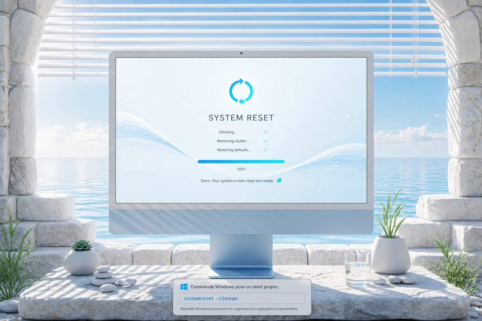
Reset Pack, reinstalling Windows in a single command
PowerShell pack to fully automate reinstalling a Windows 11 PC after a reset: apps, drivers, dev setup, tweaks, debloat, restoring configs from OneDrive.
Why?
I reset my PCs fairly often, every 3 or 4 months at home. After redoing the same steps over and over, I ended up building a small install routine — and each generation of that routine evolved alongside the tooling of the moment.
Back in 2021, it was a Reset Pack built on Ketarin — a tool that automatically downloads and installs packages from a frozen list. At the time it was perfect: 7zip, Brave, Discord, Driver Booster, Everything, FileZilla, Office 365, PatchMyPC, PUTTY, VirtualBox, VLC, XAMPP all installed themselves while I did something else. Alternatives like Ninite or PatchMyPC did the same job, mostly a matter of taste.
But by 2026, the landscape has shifted. winget ships natively with Windows 11, which makes Ketarin a bit obsolete. PowerShell 5.1 is still there, by default on every machine. My needs, on the other hand, have grown: it’s no longer just about installing a dozen apps, it’s also about rebuilding my dev environment (WSL2, gh, Git config, SSH keys), restoring my configs (Claude Code, Claude Desktop, Obsidian, PowerToys, Windows Terminal), killing ads and telemetry, pinning my taskbar, and reinstalling 30+ VSCode extensions.
Hence this V2, completely rewritten: Reset Pack, a set of PowerShell scripts that automates all of that in a single command on a clean Windows install. A few minutes later, all my apps, drivers, configs, shortcuts, scheduled tasks and even default apps are back in place. The lost day spent reconfiguring everything by hand is over.
How it works
The pack is split into 11 numbered modules, each responsible for a specific step. Every module is idempotent, meaning I can re-run it without breaking anything, and I can also run just one if needed:
- 01-apps: install via
wingetof all my apps from anapps.json(Brave, 7zip, Git, Obsidian, Signal, Steam, VLC, PowerToys, VSCode, Claude Desktop, Docker, Node, gh, etc.). - 02-drivers: NVCleanstall for Nvidia + SDIO for chipset/audio, run in silent mode.
- 03-dev-setup:
git config, WSL2 Ubuntu, long paths,gh auth loginwith SSH key generation. - 04-symlinks: restores configs from
OneDrive\Documents\08_Logiciels\Configs\via symlinks (Git, Claude Code, Claude Desktop, Windsurf, Windows Terminal, PowerToys, Obsidian). - 05-vscode: reinstalls all extensions from a frozen list.
- 06-tweaks: visible file extensions, hidden files, classic context menu, widgets/Copilot off, telemetry off, Win+V on.
- 07-defaults: Brave as default for web/pdf/html, VLC for media, via SetUserFTA (otherwise Microsoft blocks programmatic changes to file associations).
- 08-debloat: Cortana and preinstalled apps gone, OneDrive stays.
- 09-games: Saved Games / My Games symlinks, plus LoL/Overwatch/Dofus installs.
- 10-scheduled: weekly
winget upgrade --alltask and auto dark/light switch (7am ↔ 8pm). - 11-finalize: pin taskbar (Brave, Explorer, Terminal, Claude), hosts file for ad blocking, opens the Brave Sync page.
Alongside, a backup-configs.ps1 script that runs ahead of the reset (or periodically) and pushes all my configs to OneDrive, so that the restore step has files to point at.
And of course, the best friend of Windows productivity is still around: PowerToys, which I use every day, especially the color picker and FancyZones. It’s installed by the 01-apps module and its config is restored by the symlinks step.
My contributions
All of it, end to end. Modular architecture, PowerShell scripts, common helpers (banner, colored log, safe symlinks with automatic backup of the existing target, retry, force-download for OneDrive Files On-Demand), interactive vs -Auto mode, automatic admin elevation, normalization of comma-separated args (because PowerShell 5.1 handles that poorly). I also planned for two variants depending on the target machine (Codect and EXODIUS), which lets me keep a slightly different app set per box.
Takeaways
Idempotence is the key. A script you don’t dare re-run because you don’t know what’ll happen is a script you stop maintaining. Here, I can re-run any module ten times in a row and nothing changes if the state is already correct. So I test fearlessly, and that’s what let me iterate fast.
PowerShell 5.1 has real gotchas. Comma-separated parameters via -File not splitting into [string[]], admin permissions getting lost on relaunch, symlinks that can be locked by PowerToys or Claude Desktop while you try to replace them. Long story short, retries had to go almost everywhere, because we’re on Windows and nothing is ever guaranteed.
Centralizing configs on OneDrive is a win. Before, my configs were scattered around, and at every reset I’d lose stuff. Now everything lives in OneDrive\Documents\08_Logiciels\Configs\, implicitly versioned by OneDrive, and symlinks do the rest. If I tweak a config on one machine, it propagates on its own.
Default apps on Windows 11 are locked down. Microsoft prevents programmatic changes to file associations, so you have to go through SetUserFTA, which exploits an internal hash to push changes through. Shame it has to be this way, but the workaround works perfectly.
Context
Personal project, V2 of a routine I’ve been maintaining since 2021. The prospect of spending another full day reinstalling, configuring, re-pinning the taskbar, and re-checking fifty-two boxes in Windows settings at every reset is what pushed me to take it much further than the original Ketarin version. The pack was paired with Claude Code, which let me crank fast on the modules themselves and focus on the edge cases (error handling, retries, winget quirks, etc.).
Happy installs, and most of all, happy routine.
Tech stack
-
PowerShell 5.1+
-
winget (Windows Package Manager)
-
WSL2 / Ubuntu
-
SetUserFTA (file associations)
-
NVCleanstall + SDIO (drivers)
-
gh CLI (GitHub auth)
-
OneDrive (config storage)
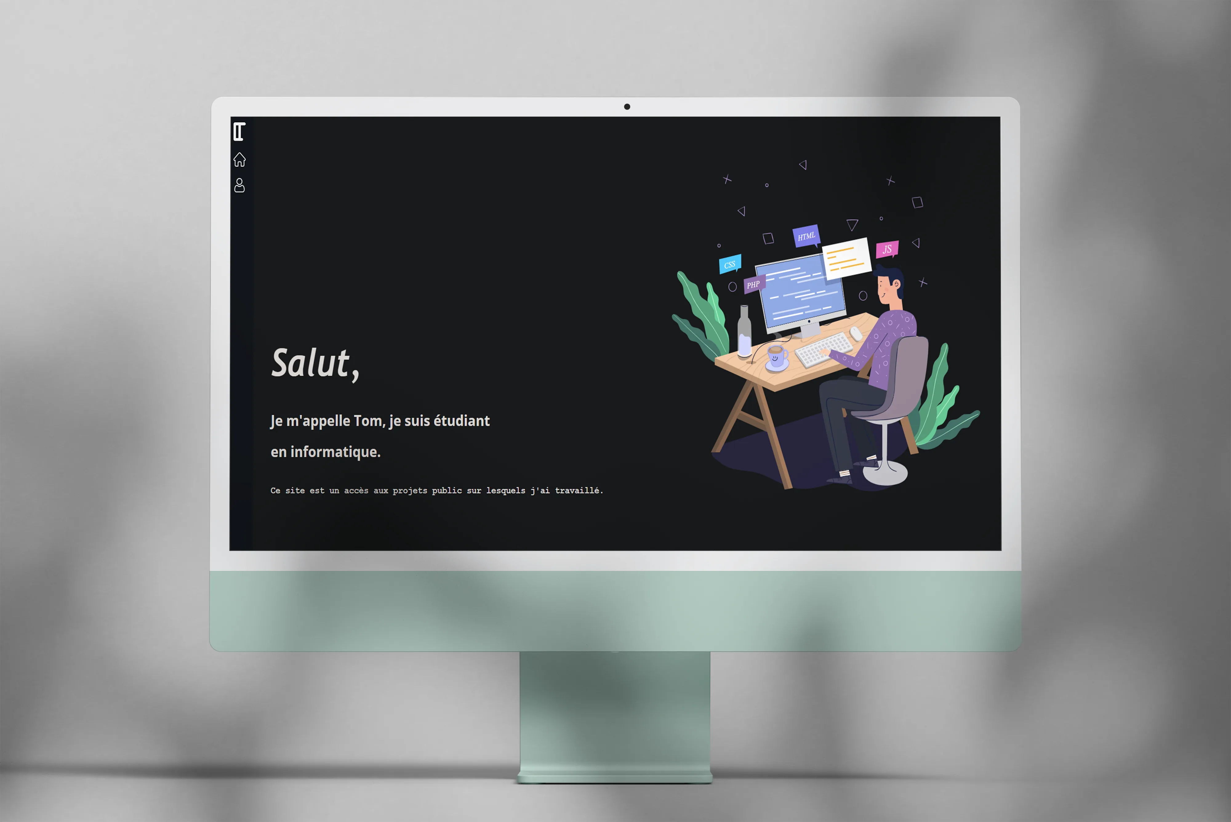
tom-lefrere.fr, my personal site across four lives
History of the four versions of my site, from pure PHP in 2019 to Astro + Sveltia CMS + MCP today. A permanent experimentation ground.
The project
Since 2019 I’ve been maintaining my personal site to showcase projects and try out new web tech. It’s gone through four successive versions, which makes it a pretty good mirror of my evolution as a developer. Each rewrite was a chance to dig into a new stack, test what actually works, and throw away what doesn’t last.
Version 1, 2019
Very simple first version, pure PHP with a few JavaScript animations. Minimal features obviously, but it was my first real production experience, which counts a lot when you’re starting out.
Version 2, 2020
Full rewrite in Vue.js to learn the framework. Added libraries like GSAP and jQuery for more polished animations. Typically the version where I wanted to prove I could do it, especially on the visual side.
Version 3, 2021-2026
Migration to WordPress to simplify maintenance and focus on content rather than infrastructure. Much less time maintaining, much more writing, which was the right balance at the time. But over time, the WordPress + plugins + custom theme combo got heavy, slow to load, and the editorial experience no longer fit me.
Version 4, 2026 · current
Full rewrite in Astro 5 (SSG) with Sveltia CMS, an MCP server, and O2switch deployment via GitHub Actions. This version has a different ambition from the previous ones: become a reliable, fast, measurable, bilingual and traceable site, without sacrificing the slightly alive side I like.
The principles that guided the rewrite:
- Fully static for zero server compute at runtime, near-instant TTFB, and zero infrastructure load on the host.
- Deep Space theme: night blue background
#0a0f1f, yellow accent#fdf854, Space Grotesk + JetBrains Mono typography. Consistent atmosphere end to end. - Natively bilingual (FR / EN) with auto-detection,
/and/en/URLs, self-referencinghreflang, and 27 projects + 2 legal pages translated line by line. - Git-versioned content in
src/content/projects/*.mdxwith Zod-validated schema, instead of an opaque database. - Continuously audited: every CI push re-runs eco and accessibility audits, results shown live in a dedicated site app (Impact 🌱).
What it actually looks like
- Tom OS, a CV section that mimics a macOS desktop with a row of clickable apps (Experience, Education, Skills, Terminal, SHAP Playground, Iris UMAP, Pokémon-like Booster, Snake, Impact). A slightly playful metaphor that fits me better than a plain PDF download.
- Command palette (⌘K or Ctrl+K) to jump to any project, open an app, switch language, toggle blueprint mode, mute audio. Fuzzy-search, multi-groups, deep-link via
?q=. - Portfolio in 3 views: a scrolling slider, an editorial list, and an SVG constellation where each project is a star positioned on a year × category plane. Full-screen modal opens without leaving the page, deep-link via
#p-slug, close button that rotates on hover. - Multi-tag filters: search input + multi-select toggle pills + top-N with “see more”. 40 distinct tags automatically extracted from article content via a regex dictionary.
- MCP server exposing the site content as tools for Claude Desktop or Claude Code. 12 tools (list/get/create/update/delete projects, pages, medias, git_status, commit_and_push), Zod validation,
SITE_ROOTsandbox, integration tests vianode --test. - Impact app with live eco scores (96/100 via Sustainable Web Design v4), a11y (99/100 via WCAG 2.2 heuristics), tests (15/15 passing), runtime perf. Each gauge has a collapsible methodology that explains the computation, so it’s auditable rather than just decorative.
- Rich editorial bits: styled PDF buttons, responsive galleries with hover zoom,
<VideoEmbed>component for demos, all from MDX.
My contributions
Everything, end to end. Design, architecture, integration, audit tooling, deployment, docs. The repo also includes:
- Automated scripts:
eco-audit.mjs(carbon impact per visit),a11y-audit.mjs(63 pages scanned),extract-tags.mjs(auto-tagging via regex),optimize-images.mjs(PNG → WebP via sharp),generate-audit-report.mjs(serializes scores to JSON consumed by the Impact app),import-wp.mjs(initial WordPress migration). - CI tests: 6 build structure tests, 9 MCP tests in stdio JSON-RPC, always green before merge.
- GitHub Actions: check + build + test + audit + mcp-test jobs in parallel, O2switch FTPS deployment after every push to
main. - Cloudflare Worker for GitHub OAuth (api.netlify.com stopped supporting non-Netlify sites in 2026). Free, 5-minute deploy, secrets-side secure.
- SEO 93/100: i18n sitemap, robots with
max-image-preview:large, self-ref hreflang, Person + WebSite + BlogPosting + BreadcrumbList schemas (eligible for Google rich snippets), 1200×630 SVG OG images generated on the fly per project.
What I took away from this V4
SSG is real comfort. Once I migrated to Astro, dev speed exploded. Instant hot-reload, no database to babysit, all content in git with clean diffs. For a personal portfolio, it’s the right level of abstraction, really.
LLMs are changing the editorial game. The idea of an MCP server on my own content was a bit experimental at first. Now I can ask Claude “list my projects by date, create a draft foo, commit and push”, and it’s done. Huge friction reduction on small updates, and it opens the door to more ambitious usage (auto-tagging, title suggestions, cross-linking, etc.).
Measuring is already fixing. The Impact app displays scores live on the site. Making the numbers visible forces you not to let them slip. When the eco score drops below 90, I see it on every new feature I push, so I trade off differently.
Accessibility has a zero cost. 99/100 on the a11y audit isn’t a goal in itself but the natural result of good practices (semantic landmarks, systematic alt, skip link, decent contrast). The only remaining “low” is the missing skip link on the CMS /admin/ page, which is deindexed anyway.
Bilingual is doubly work. 27 projects × 2 languages = 54 articles to maintain. Without solid multilang infrastructure (lang schema, getCollection filter, en/xxx → xxx slug normalization), it quickly becomes a nightmare. No regrets, but you have to be aware of the load.
Context
Personal project, ongoing since 2019. V4 was built in an intensive week with Claude Code, code entirely written and audited pair-programming with it.
Tech stack
| Layer | V4 (2026) |
|---|---|
| Framework | Astro 5 (SSG, content collections, i18n) |
| Language | TypeScript |
| Styling | CSS custom properties + occasional Tailwind |
| Content | MDX + gray-matter + Zod validation |
| CMS | Sveltia CMS (modern Decap fork) |
| CMS auth | Cloudflare Worker OAuth (sveltia-cms-auth) |
| MCP | @modelcontextprotocol/sdk on stdio JSON-RPC |
| Image | sharp (PNG → WebP, -97%) |
| Host | O2switch (cPanel Apache) |
| Deploy | GitHub Actions FTPS |
| Tests | node —test (native, zero deps) |
Previous lives for the record:
- V1: PHP / JavaScript (2019)
- V2: Vue.js / GSAP / jQuery (2020)
- V3: WordPress (2021-2026)
- V4: Astro + Sveltia CMS + MCP (April 2026)
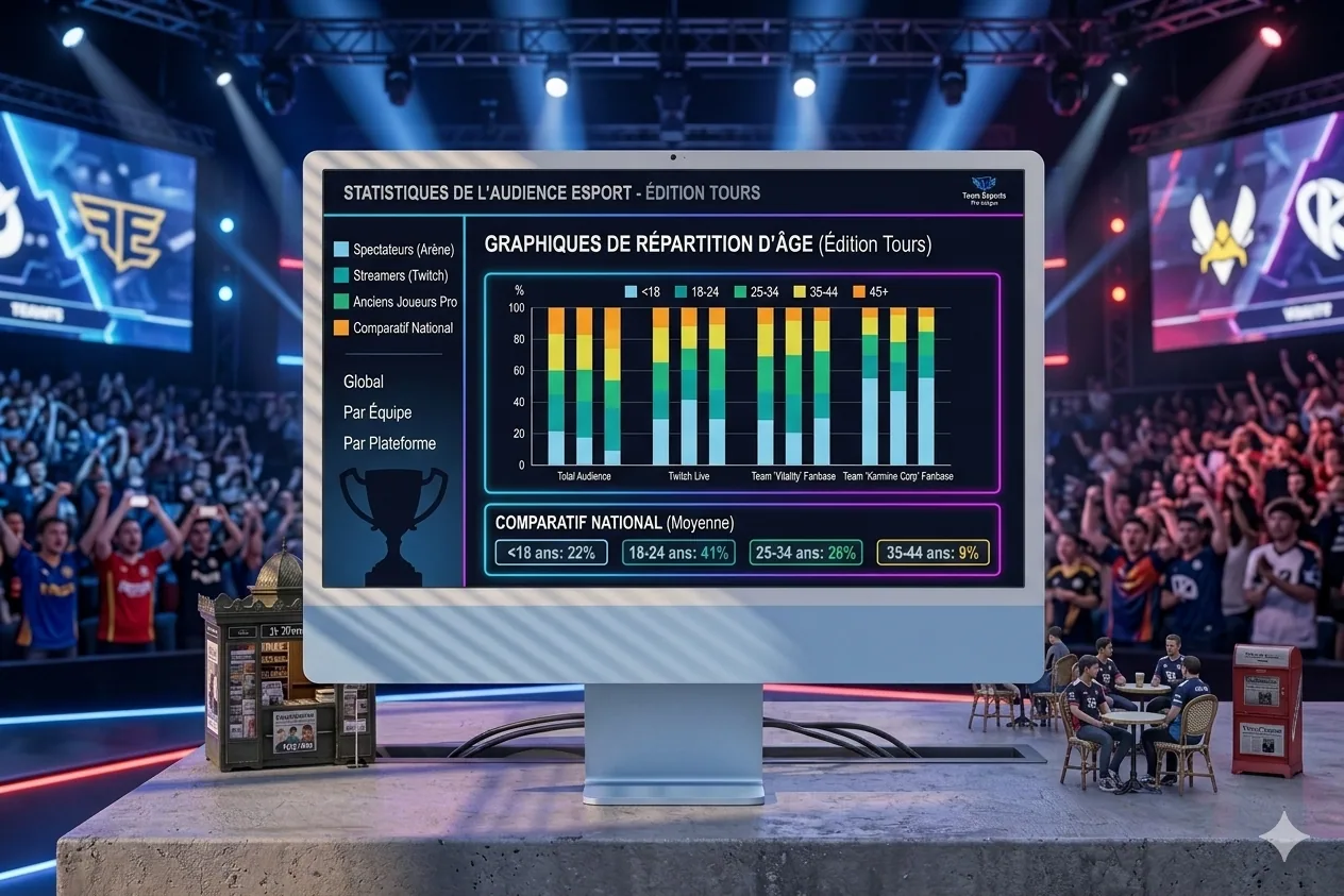
Esport Stats, a small data investigation on pro scenes
A personal project starting from a silly question (who are the youngest? who are the oldest?) that ended as a small editorial report with Python, Plotly, a printable PDF, and a few methodological traps along the way. Here's how it went.
A data project done over a weekend, starting from a silly question about pro players’ ages, that ended as a 15-page editorial report. One of those things you start on a Saturday evening thinking “OK, quick one”, and obviously not at all.
So it all started from a curiosity one evening. I was wondering, it’s something we often hear without checking, whether it was true that FPS scenes end careers early, and that Dota 2 is full of veterans hanging around for ten years. I wanted a clean, quantified answer, and while I was at it, something not too ugly to look at. So I opened a notebook, told myself I’d wrap it up in two hours, and obviously it took a bit more.
The starting point
The initial idea was to scrape Liquipedia, output a bar chart, move on. I quickly changed my mind when I found PandaScore, a well-made esport API, especially for anyone who wants structured data without parsing unstable HTML. 1,000 requests per hour on the free tier, clean endpoints for players, teams, tournaments. Plenty for this kind of exercise.
I picked six games: League of Legends, Counter-Strike, Dota 2, Valorant, Rainbow 6 Siege and Overwatch. The plan was to only look at tier S, the elite (LCK, LEC, VCT Masters, BLAST Major, The International, that kind of thing), and only active players. No semi-pro, no retired players still lingering in the DB. A 2026 snapshot, not a census.
First roadblocks
The first hours were a little tour of classic traps, the kind that make you doubt the API before you realize you just fooled yourself.
-
The
birthdayfield seemingly missing from responses, when actually PandaScore just omits null fields. Faker has his birthdate, an anonymous tier-3 player doesn’t, which is normal. Lost an hour before I got that. -
API slugs don’t always match the games. In the list it’s
cs-go, but in the URL you have to write/csgo/. Same fordota-2becoming/dota2/. Small detail, but it costs you three 404s before clicking. -
No
tierfield on leagues, but yes on tournaments. So the useful filter isfilter[tier]=sapplied to tournaments, not leagues. Once you get that, it rolls. -
Rate limits obviously, which burn fast when you explore by trial and error. I blew through the 1,000 calls in one session, which was the perfect moment to add a JSON disk cache on every request. Re-runs are now instant, and it’s clearly five minutes of code that saved me a ton of time later.
The pipeline
The final architecture fits in three Python scripts, chainable without asking questions. First, etl.py, hits PandaScore and outputs four CSVs. players_top.csv for unique active players, tournaments.csv for tournament metadata (with winner), participants.csv linking tournament to team, and above all rosters.csv, the real keystone, which contains historical rosters, i.e. who played what when. More on that below, this file is what let me fix the methodological mistake I mention later.
The second, viz.py, turns the CSVs into an editorial HTML report. That’s where I tried to step out of “utility dashboard” territory toward something more readable. Serif typeface for titles (Cormorant Garamond), sans-serif for body (Inter), a cream and terracotta palette, italic captions. Plotly themed to stay consistent with the rest. Eleven charts, a sortable DataTables table, and auto-generated insights at the top (“Dota 2 is the most mature scene, 2.5 years older than Overwatch”).
The third, pdf.py, uses Playwright to load the HTML into headless Chromium, wait for Plotly to finish rendering, apply the @media print CSS, and output a 15-page PDF. Not the most trivial part, more on that too.
The methodological trap to spot
The part I’m most glad I caught, because honestly it could have slipped through. In the first version of the report there was a chart of median age year over year, very clean visually. Except it was linear by construction, i.e. I was taking the current cohort and walking back in time with year - birthdate. Every player aging by exactly one year per year, the median shifted mechanically by one year. Zero real information, but obviously, it looks like it says a lot.
What saved me was a question from the “client” (me, re-reading cold) who said it looked a little too good. I looked again, and yes, it was a pure mathematical artifact. Important reflex, which we don’t always have: ask yourself whether a chart that feels telling could have been built otherwise than by reflecting a truth.
The fix came from a small API discovery. The /tournaments/{id}/teams endpoint doesn’t return current rosters of teams that played, it returns rosters at the time of the tournament, which changes everything. By saving a rosters.csv table with one row per (tournament, team, player), we can compute for each year who actually played and what age they were then. Each year gets its own cohort, newcomers enter, veterans leave, and the chart becomes genuinely informative.
Result, Dota 2 gained about 2 years of median since 2020, R6 Siege gained 3, Counter-Strike is stable, Valorant too. The kind of result that matches community intuition, which is reassuring after a big methodology bug like that. Even so, obviously, it should be taken with caution: we don’t cover all years at the same depth, especially the very old tournaments.
What the report reveals
A few results I find interesting, though obviously it’s a point-in-time snapshot and not absolute truth.
-
Dota 2 is the most mature scene with an average age of 26.8, and Overwatch the youngest at 24.3. 2.5 years apart, which is significant at the scale of a pro career, and roughly tracks the lifespans of games in the ecosystem (Dota 2 running since 2013, Overwatch restarted more recently with OW2).
-
The most international scene by Shannon’s index is Counter-Strike (0.82). The most homogeneous is Overwatch (0.63), heavily dominated by Korea and the US. Not surprising for anyone following the scene, but still nice to have it quantified.
-
62% of tier-S Counter-Strike players come from EMEA. The record regional concentration in the dataset.
-
In League of Legends, winning rosters are on average 0.4 year younger than the scene. Small but measurable gap. Not enough to build a grand theory, but it’s a small signal.
-
The oldest is TaZ (39, Counter-Strike), the youngest TaiLung (15, Dota 2). A 24-year spread within the same pro ecosystem.
The visualizations
The report is structured in five parts plus an annex. Part one on pro ages, with a bar chart of averages, a ridgeline plot of distributions (more editorial than a classic violin plot, small detail but it changes the read), and a table of the oldest and youngest. Part two on scene evolution, with stacked birth cohorts and the fixed time curve.
Part three is the densest: geography. A world choropleth, top 15 countries, regional shares per game (EMEA, Americas, Asia, Oceania), small multiples for the top 6 countries per discipline, a Sankey of migrations (player born in one country, signed by a team in another), Shannon’s diversity index, and independent mini-maps per game. Maybe a bit much, but it was hard to pick.
Part four is on performance. Average age of winning rosters vs. the whole, and a top 3 of teams per discipline, normalized by the number of tournaments in the game. Normalizing is obvious in hindsight, but at first I had a raw top, which made Counter-Strike crush everything just because it has three times more tournaments than LoL. Typical kind of bias you catch by looking at the chart and thinking “wait, that doesn’t tell the story I want”.
Part five is one tile per game with key numbers and role composition. And in the annex, a small comparison with traditional sports: NBA 26.4, Premier League 27.1, NFL 26.6, ATP 27.3, esport 25.4. Elite esport rosters are much younger than most pro sports, but the gap is less dramatic than you’d think, especially if you isolate scenes like Dota 2 which sit at Premier League level.
The PDF render
Getting a clean PDF from Plotly is not at all trivial, something I hadn’t measured going in. Charts are interactive SVGs, sized at first render in the browser. So if you just flip to print, the layout breaks, because the chart keeps its original width (typically 1,200px HTML viewport) while the A4 page is 794px.
The recipe that works with Playwright: load the HTML, wait for every .js-plotly-plot to have its .main-svg, then call page.emulate_media("print") to activate print CSS, shrink the viewport to A4 width (794px), and force a Plotly.Plots.resize() on every chart to recompute. Wait a second and a half for the relayout to stabilize, then page.pdf(). A bit cobbled, but the output is clean.
Print CSS has its own rules: collapse two-column to single-column (charts span full width), hide the DataTables chrome that makes no sense offline, impose clean page breaks between major parts, shrink heights so a chart fits with its caption and methodological note on a single page. Many small adjustments before you get a PDF you actually want to open all the way through.
What’s left for V2
Two tracks need more API compute time and will move to V2. First, career longevity, which requires hitting /players/{id}/tournaments for every player. That’s 2,600 requests, or about three hours of fetching within the rate limit. Hypothesis: careers are very short on FPS, much longer on MOBA. Would be interesting to quantify.
Second, roster rotation, the percentage of players who change teams year over year. A metric often commented on by the community, especially around off-season transfers, but rarely properly measured. Should be doable without many extra calls since we already have rosters.csv.
Tech stack
Nothing exotic. Python 3.13 with requests, pandas, numpy, pycountry, python-dotenv. Plotly for all charts, with a custom simple_white theme. DataTables.js for the interactive table (lightweight, does the job). Playwright plus headless Chromium for faithful PDF rendering. And PandaScore as the single data source.
What this project taught me
Three things struck me, more or less connected to the subject itself.
First, a chart that looks clean can hide a major methodological bias. The reflex of asking yourself “could this line have been built otherwise than by reflecting a truth?” is worth its weight in gold. My linear chart could have passed for insight, while it was a pure artifact. So I try more and more to do this kind of cold re-read, ideally the next day, because fresh off the build we’re a bit too proud of the result to critique it honestly.
Second, the difference between a utility dashboard and an editorial report. It holds to very little actually: a serif typeface for titles, a muted palette, italic captions, polished page breaks. But it completely flips the reader’s perception. A detail of form that shifts the mental category the document gets filed under.
Third, more banal but worth noting: there’s always a rate limit somewhere. Adding a disk cache at the start of exploration is five minutes of code that saves fifty. I know it, I try to do it, and I still forget one time out of two.
The full editorial report (15 pages)Project wrapped in an evening and a few extra hours. With PandaScore’s paid API other horizons open up (more history years, more calls for longevity), but even in free tier, it’s a solid base for anyone who wants to play with esport data. And honestly, if you’re looking for a data project idea that’s rich, feasible, and original enough to fit on a CV, this is typically the kind of subject I’d recommend. There you go.
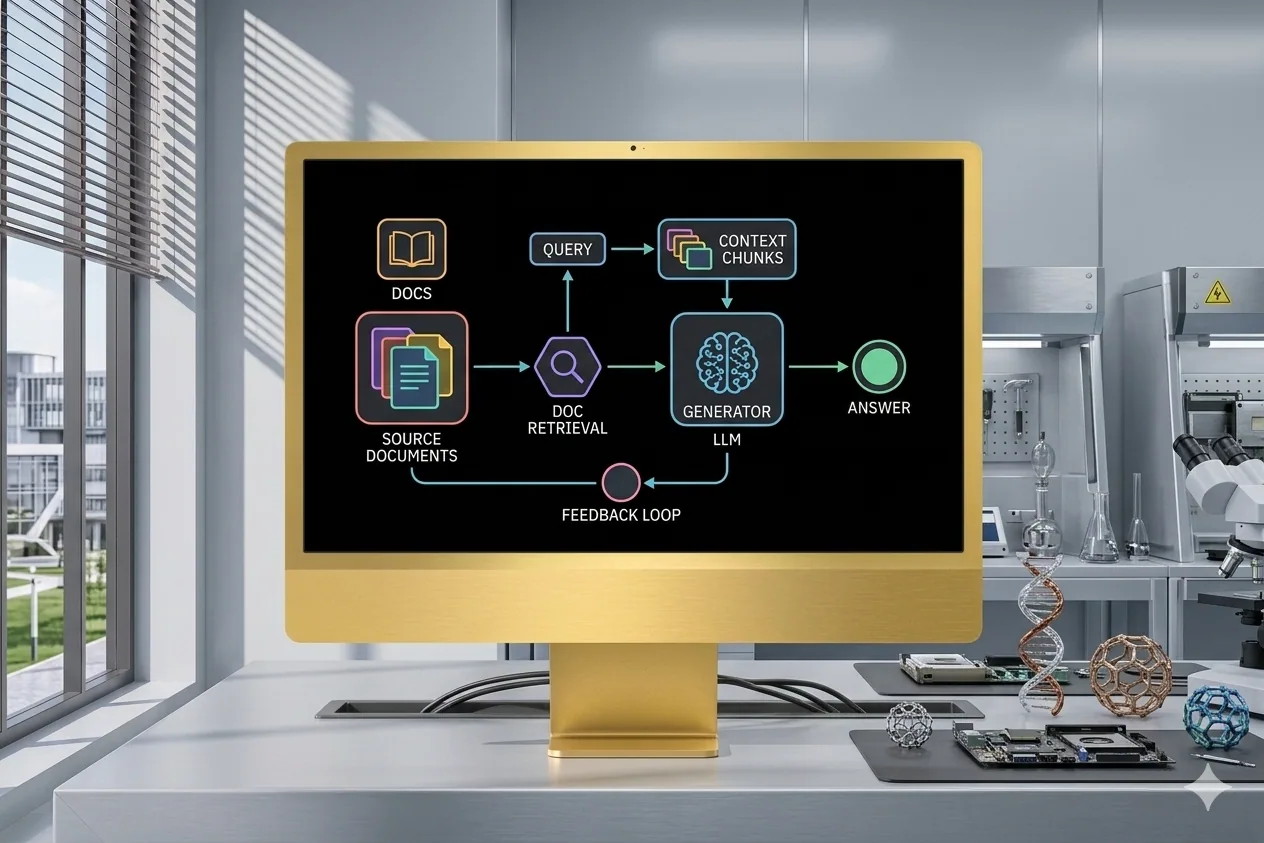
Manim Animations
Pedagogical animations generated with Manim driven by an LLM, to visually explain technical concepts like RAG.
The project
This is something I care about: I love explaining things visually, but making animations takes forever. Discovering Manim (the library behind 3Blue1Brown’s videos) opened an opportunity: use an LLM to quickly generate coherent visual representations of technical concepts. Here it was RAG, but obviously the approach works for any technical subject, especially the ones we explain poorly in person.
My contributions
LLM-driven Manim scripts to generate technical animations. Two variants of RAG animation (continuous and smooth) with different visual approaches. Optimized the LLM-to-Manim-to-GIF workflow to save a bit of iteration time.
Takeaways
Manim is an incredible tool for technical popularization. Pairing an LLM with an animation-generation tool opens huge possibilities to produce pedagogical content quickly. The main challenge is still getting clean visuals on the first try, which doesn’t always happen, and you often need to re-prompt a bit.
Context
Personal project, born of the urge to popularize complex AI concepts (RAG here) visually and elegantly, without spending days on it. The idea was really to have a fast production pipeline for animations.
A one-shot example
Tech stack
-
Python
-
Manim
-
LLM (assisted generation)
Cover image generated by Nano Banana (Google), since I no longer have the mockup template I used before. So it’s not a screenshot of the actual tool.
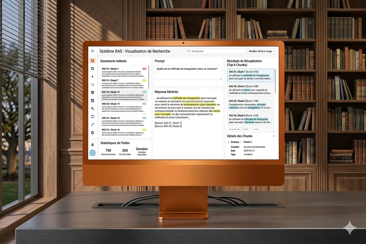
Answer, RAG visualization on documents
Enriched fork of Dataiku's Answer project for RAG visualization, with extra features requested by clients.
The project
Answer is a fork of Dataiku’s Answer project, which ships a turnkey RAG visualization web app. Day to day, a fair amount of features were missing, and my clients kept asking for improvements. So I took matters into my own hands and forked it to plug the gaps. Typically the kind of situation where you could wait for an official release, but in consulting, that’s not really how it works.
My contributions
Forked and extended the original app: added client-requested features, improved the RAG visualization, fixed issues and adapted it to the real-world use cases we hit in enterprise settings. The idea was to keep a version that’s usable right away, without waiting for upstream to move.
Takeaways
Taking an existing open source project and adapting it to real field needs is a great exercise. It helped me understand RAG in depth, and what enterprise users actually want, which is often pretty far from the demo cases you see in presentations.
Context
Professional project. As a consultant I kept noticing the same gaps in Dataiku’s RAG visualization tool. Rather than wait, I forked it to address them, even if it means re-syncing later when upstream catches up.
Tech stack
-
Python
-
Node.js
-
Gulp (build system)
-
Playwright (tests)
-
OpenAPI
-
Dataiku
Cover image generated by Nano Banana (Google), since I no longer have the mockup template I used before. So it’s not a screenshot of the actual tool.
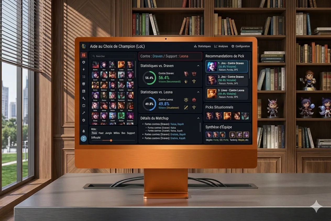
BestPick, a champion recommender for LoL
Quick interface that tells me which champion to play against my opponent in League of Legends, based on my pool and matchup data.
The project
I’ve always been fairly bad at League of Legends, and I only master a pretty narrow champion pool. BestPick is a simple interface where I pre-select the champions I can play, and when I know my opponent, the tool tells me which of my picks is the best fit against them. A small, quick project, but it works well, mostly because the underlying need was very concrete.
My contributions
Full build: Python scripts to scrape matchup and winrate data, SQL database for the stats, and a PHP web interface for quick in-game lookups. The idea was to make it accessible in two clicks, because the champion-select window is short.
Takeaways
Even a tiny utility project can feel very satisfying when it solves a real problem. Combining Python on the data side and PHP on the web side works well for this kind of case, especially when you want to separate scraping from display. And video-game matchup data is a fun playground for analysis, even if obviously it doesn’t replace practice.
Context
Personal project, born of the need to optimize my champion-select phase in ranked when your pool isn’t huge. Typical “build this to save two minutes and a bit of winrate” project.
Tech stack
-
Python
-
PHP
-
MySQL / SQL
-
HTML / CSS / JavaScript
Cover image generated by Nano Banana (Google), since I no longer have the mockup template I used before. So it’s not a screenshot of the actual tool.
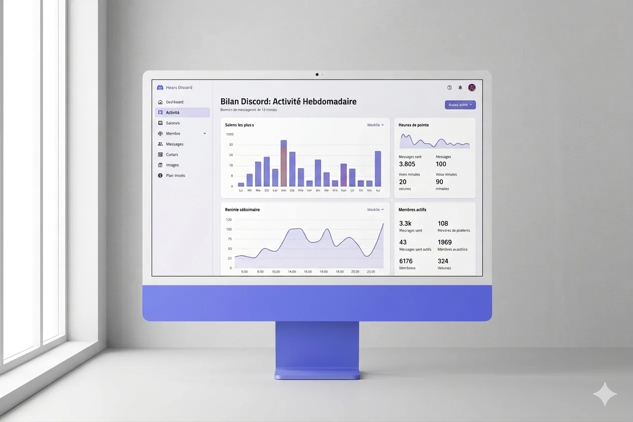
Discord Recap, my own annual wrap, my way
My own Discord wrap, much richer than the official one, with Recharts visualizations and PDF export, in React 19 and TypeScript.
The project
While doing my 2025 year-in-review, I realized I couldn’t access Discord’s because I don’t share my data with them, and honestly, their wrap was pretty thin anyway. So I thought: if this data exists somewhere, I need to grab it and do something with it. I built my own recap system, with plenty of extra indicators: playtime, number of sessions, and more. The result is way more interesting than what Discord ships.
My contributions
Full web app build: React interface in TypeScript, interactive visualizations with Recharts, PDF report generation with jsPDF, and multi-page navigation with React Router. The idea was to export a clean, shareable document, not just an ephemeral dashboard.
Takeaways
Pulling your own data and doing something better than the original platform is deeply satisfying. React 19 with TypeScript offers a very smooth dev experience, especially for typing props and hooks. And Recharts combined with jsPDF lets you export clean visual reports, even if there are obviously a few layout contortions for the PDF.
Context
Personal project, born of the frustration of not having a proper Discord wrap. Inspired by Spotify Wrapped, applied to my Discord community. Typical kind of thing that starts from a gap and ends as a small, useful personal tool.
Here’s an excerpt of the PDF result
Discord 2025 recap, full versionTech stack
-
React 19 / React Router DOM
-
TypeScript
-
Vite 7
-
Tailwind CSS 4
-
Recharts
-
jsPDF
-
ESLint
Cover image generated by Nano Banana (Google), since I no longer have the mockup template I used before. So it’s not a screenshot of the actual tool.
Divine Simulation, AIs playing gods in WorldBox
Four AI agents play gods with contrasting personalities in WorldBox, negotiate in council, scheme, and weave their religions over 1000 years of simulation.
The project
It all started from a WorldBox session. For those who don’t know, it’s a god game where you watch civilizations be born, fight, found religions, and get steamrolled by a meteor you triggered two minutes earlier. And at some point I asked myself: what if the game’s gods were real AIs, with personalities, strategies, and grudges against each other?
So I built a system where four AI agents (Claude, via Anthropic) each play a god, Ares the warrior, Gaia the benevolent, Loki the trickster, Athena the strategist. Each god drives several religions in the game, blesses followers, curses enemies, triggers catastrophes, negotiates in the council of gods, and obviously schemes against the others whenever possible.
The end goal is to film a 1000-year simulation and make a YouTube video of it, to see what kind of divine personality wins out when you let them loose for long enough.
The architecture fits in three pieces:
- A C# mod that exposes the game state via an HTTP API (42 tools)
- A Node.js orchestrator that makes the gods think via Claude and executes their actions
- A React dashboard to visualize everything in real time and replay sessions
My contributions
The WorldBox mod (C# / .NET 4.8)
Full build of WorldBoxMCP, a mod that exposes the game via an HTTP JSON-RPC 2.0 server. Concretely, it delivers:
- 42 MCP tools. Reading the world state (kingdoms, creatures, religions with founder, traits, notable followers), divine actions (blessings, curses, catastrophes, diplomacy, terraforming), time control (pause, speed), and religion integration (adding traits like
summon_lightningornecromancy, converting followers, changing banner colors). - Unity threading handled through a custom
MainThreadDispatcher. HTTP calls land on a background thread, but game operations have to run on the main thread, otherwise Unity yells and the game crashes. Classic, but it had to be done properly. - Pathfinding fix. Creating artificial islands was crashing the game because nav regions weren’t recomputed after terraforming. Debugged via Unity logs, rebuilt
MapChunks on the fly, and it holds. - Game decompilation via ILSpy to understand internal APIs. The religion color system goes through
ReligionColorsLibrary, traits throughReligionTraitLibrary, converting a follower viaactor.setReligion(). Without decompilation, it would’ve been pure scraping.
The orchestrator (Node.js / TypeScript)
The simulation’s brain. The tick loop goes like this: pause game → snapshot world → council of gods (3 rounds of debate, Sonnet) → parallel thinking of the 4 gods (Haiku) → action validation by budget → execution via MCP → unpause game.
A few points I spent real time on:
- Divine Power. Each god accumulates points based on a ratio of
followers / total worldwide. Points stack across 10 ticks, and every action has a fixed cost (1 point for abless, 6+ points to add a religion trait). The server enforces costs, so if a god cheats, their actions get rejected wholesale. This is what eventually produced real balance, I’ll come back to it below. - Multi-religion. Each god manages 5 to 7 religions in round-robin, and their power stacks all their followers. Domination of a god is directly correlated to the number of civilizations worshipping them.
- Council of gods. Three rounds of sequential debate via Claude Sonnet, the most powerful god speaks first, and the summary persists in the prompt until the next council. Creates a kind of political memory across sessions, which is exactly what I wanted.
- God-vs-god interactions. Sabotage to steal points from a rival, divine shield, provocation, empowering allies, stealing followers. Typical stuff that emerges on its own as soon as you give them the tools.
- SQLite persistence. Every thought, every prompt sent, every action, every world snapshot is saved tick by tick. On server restart everything is restored via a
sim:hydrateevent, which makes it possible to replay a full session cold, weeks later.
The React dashboard
Real-time interface to observe the simulation and intervene if needed.
- Sidebar with the gods’ avatars, all their religions, followers, and a divine power bar.
- Main dashboard: population per race, followers per god (stacked area), divine power over time, kingdom table (king, religion, protector god, population, cities).
- God panels: 10-year strategic plan, internal thoughts, recent actions with a cost badge, rejected actions crossed out, and a full debug mode with the prompt sent and Claude’s raw response. Very useful to understand why a god is doing nonsense.
- Council: debate log with colored avatars and archetype.
- Replay: tick-by-tick slider, detailed view of each event, collapsible god thoughts with prompt and response side by side.
- Overgod: direct intervention panel, to issue decrees to gods, run quick actions, or call an MCP tool by hand.
- Action Feed: real-time stream with icons, cost badge, action reason, and target creature name.
Takeaways
LLMs are mediocre players without guardrails. Probably the clearest lesson of the project. Without a point budget and server validation, the gods were making world peace in a single click and converting entire armies for free. Balance came from strict constraints: fixed costs, limited budget, rejection of too-expensive actions, and memory of past failures in the prompt. Once properly framed, the game gets interesting again.
Real impact is the hardest to obtain. Gods prefer small actions (bless one person, convert one follower) to big ones (add a religion trait that changes the gameplay for thousands of followers). So the natural growth of the game crushes divine intervention, which means you have to actively push the AIs toward high-impact actions. Counter-intuitive at first, but it makes sense: a costly action is a short-term risk for a long-term benefit, and LLMs reason pretty poorly on that kind of trade-off without guidance.
Persistence isn’t optional. I started with JSON/JSONL files, obviously, and migrated to SQLite when I realized a refresh was wiping everything. Now every thought of every god is traceable, replayable, analyzable. Typical investment you postpone and regret later.
Modding is an ideal playground for AI. WorldBox exposes enough API to build complex systems without touching the source code, and decompilation via ILSpy was crucial to understand the internal mechanics (religion colors, traits, pathfinding). Interesting format for testing what AIs can do in a non-trivial but constrained environment.
Haiku + Sonnet, the right compromise. Haiku for the 800+ action calls per simulation (cheap, enough for structured JSON), Sonnet for the ~50 council sessions (better dialogue, more personality, and it shows on the debates). Total estimated cost: around 5 to 10 dollars for 1000 years of simulation. That’s the kind of number that makes the project playable as a side project.
Context
Personal project, built in an intensive session with Claude Code. The idea comes from my passion for emergent simulations and the question: what happens when you give autonomy to AI agents in a complex system, with strict rules but room to improvise?
The C# mod, TypeScript orchestrator and React frontend code were all written via Claude Code, debugging included (pathfinding crash, religion color API, JSON parsing of Haiku responses). A fair amount of iteration on the gods’ prompts, but pretty quickly convergent on the rest.
Tech stack
| Component | Technologies |
|---|---|
| WorldBox mod | C# (.NET 4.8), NeoModLoader, Unity Engine |
| Orchestrator | Node.js, TypeScript, tsx |
| Gods’ AI | Claude Haiku 4.5 (actions) + Claude Sonnet 4 (council), via Anthropic SDK |
| Persistence | SQLite (better-sqlite3), WAL mode |
| Frontend | React 18, Vite 8, TypeScript, Tailwind CSS 4, Recharts, Zustand, Framer Motion |
| Communication | HTTP JSON-RPC 2.0 (MCP), WebSocket (ws), Express |
| Analysis | ILSpy (game decompilation) |
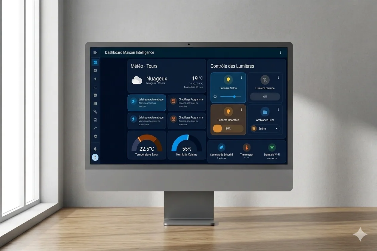
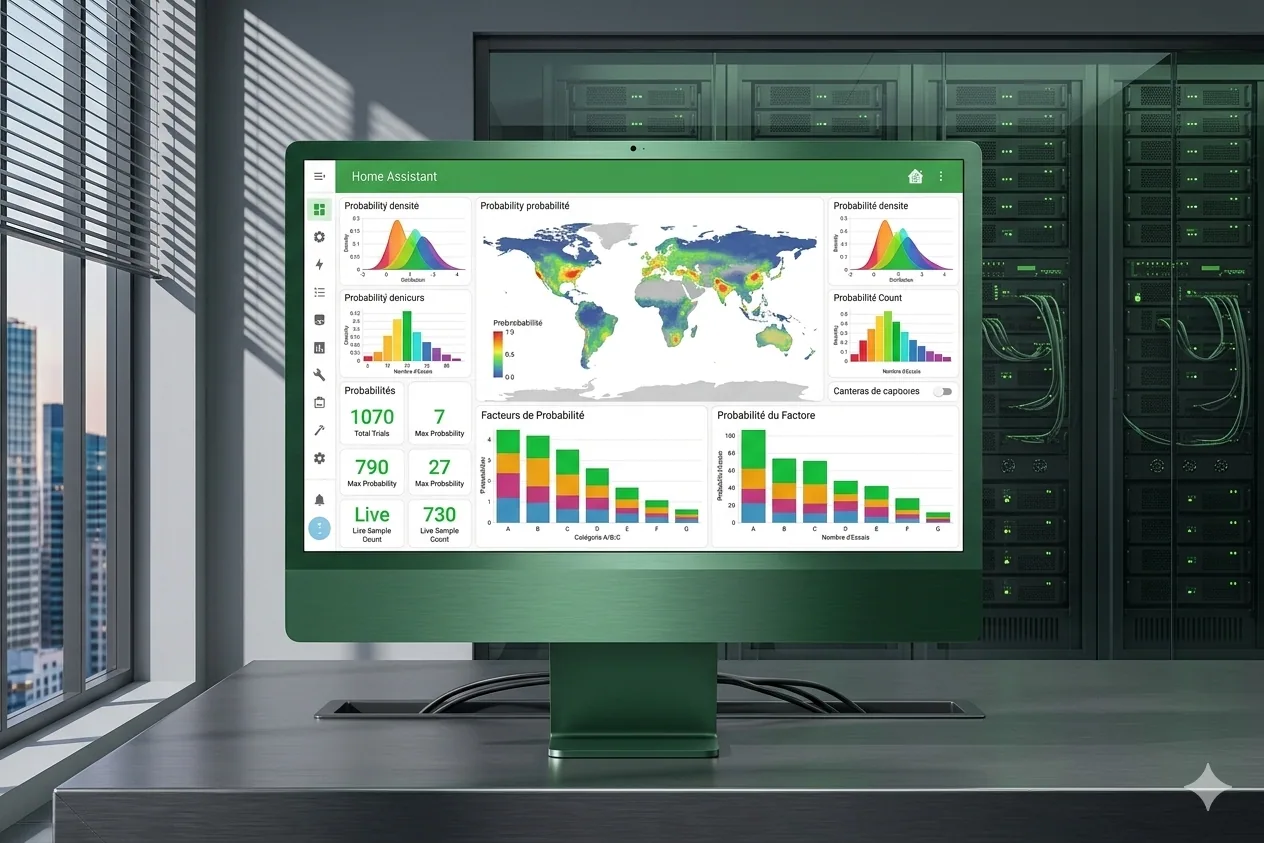
Home Assistant × Claude, home automation supercharged by AI
A Home Assistant management layer powered by Claude, letting you create automations in natural language with multi-layer validation.
The project
It’s a system that connects my Home Assistant install to Claude to dramatically speed up managing my home automation. Concretely, it lets me quickly access my setup, add what’s missing, and save a huge amount of time on creating automations. No more hours spent writing YAML by hand, which means I can finally spend time on what actually interests me: the scenarios themselves.
My contributions
Full framework build: multi-layer validation tools, entity registry integration, automated pre-commit hooks, installation scripts for Mac and Windows. I also set up a test suite and the usual code-quality tooling (Black, isort, flake8, mypy, pylint). The idea was for the project to stand on its own, especially for the weeks I don’t come back to it.
Takeaways
Integrating an LLM into a real dev workflow genuinely changes the productivity game. Obviously it doesn’t replace thinking, but it removes a lot of friction. Multi-layer validation is essential when you generate configuration automatically, because a broken YAML in Home Assistant can take down a whole lot at once. And Home Assistant, under the hood, is a very rich ecosystem, but complex to master, which takes time.
Context
Personal project. YAML configuration for Home Assistant is powerful but time-consuming and error-prone. The idea was to combine AI and home automation to automate what can be, without giving up the power of the system underneath.
Tech stack
-
Python 3.12+
-
Home Assistant / YAML
-
Claude Code (AI)
-
Voluptuous / PyYAML
-
pytest / pre-commit
-
Black / isort / flake8 / mypy / pylint
Cover image generated by Nano Banana (Google), since I no longer have the mockup template I used before. So it’s not a screenshot of the actual tool.
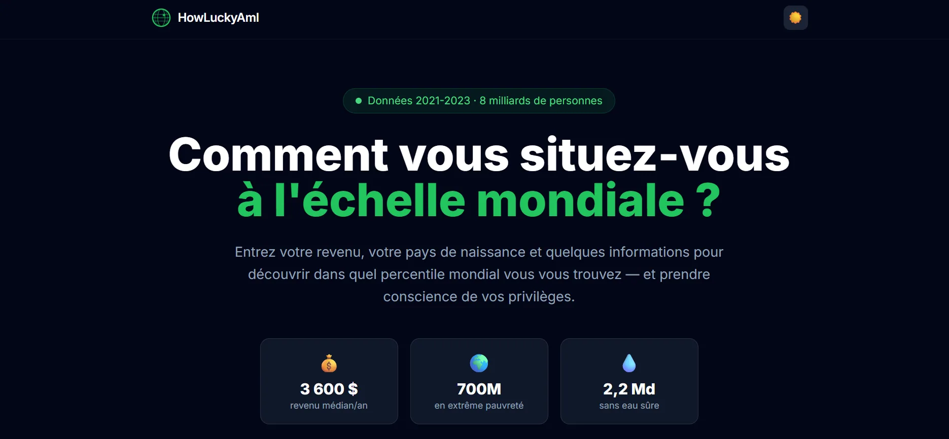
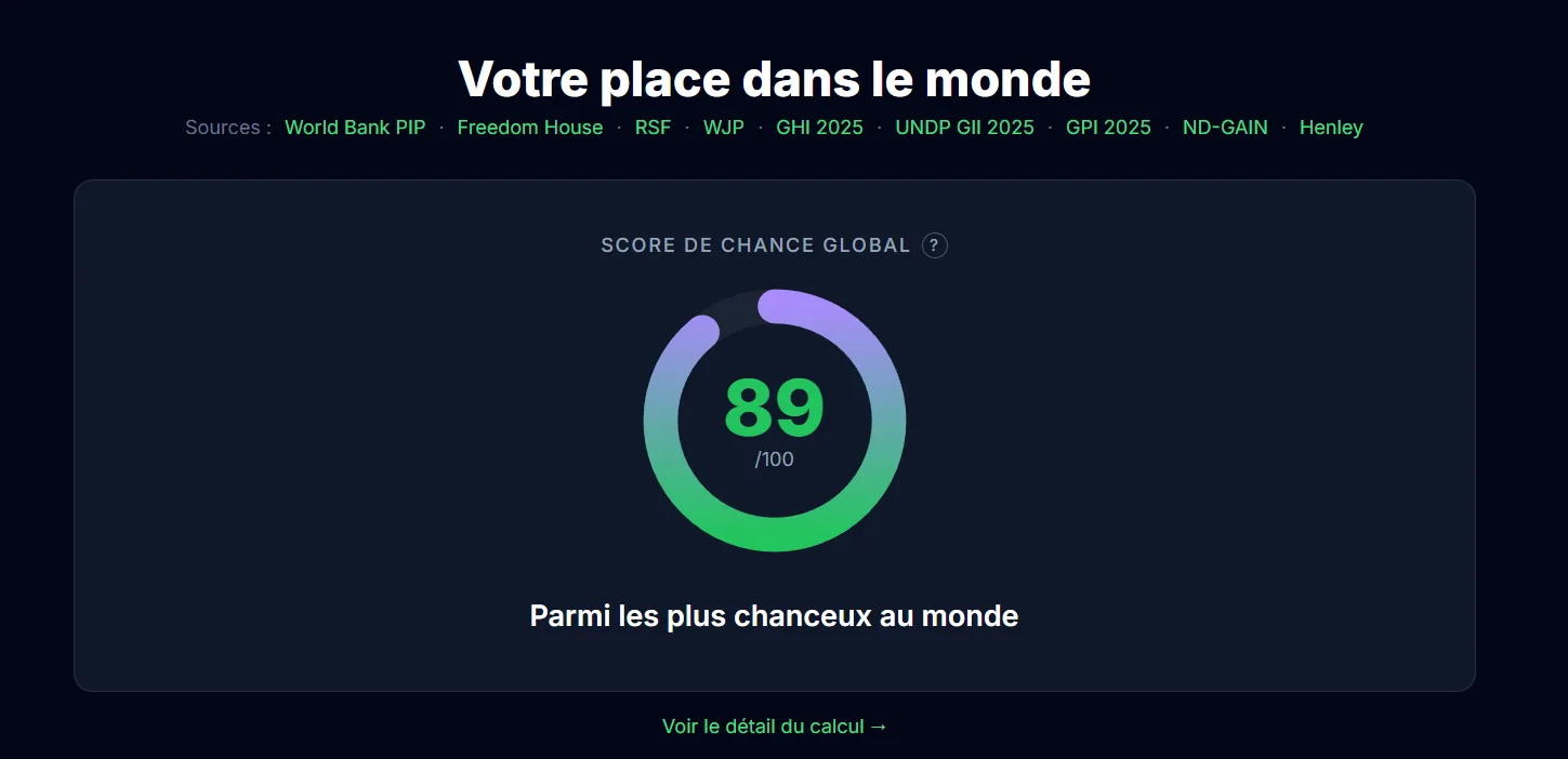
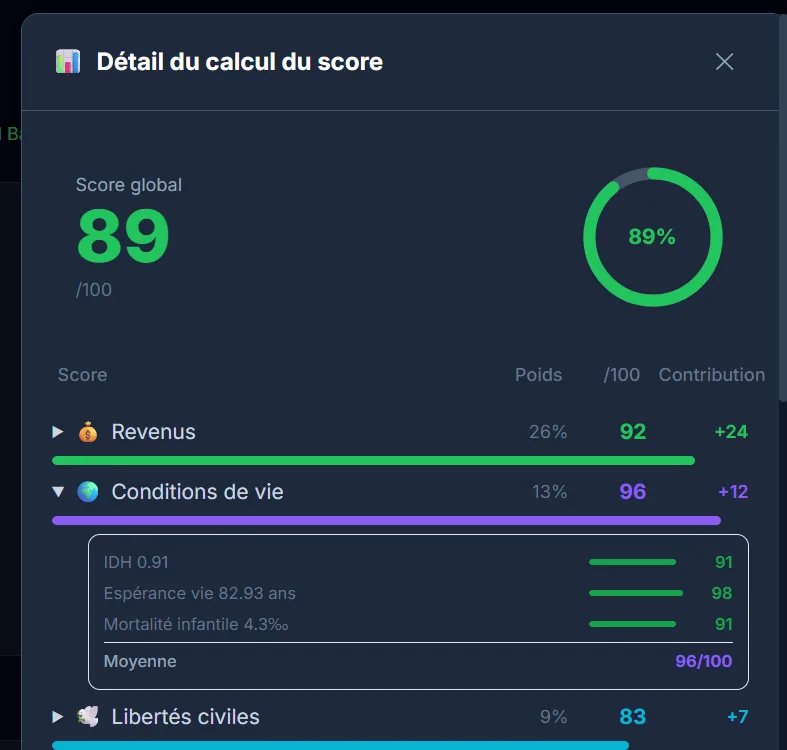
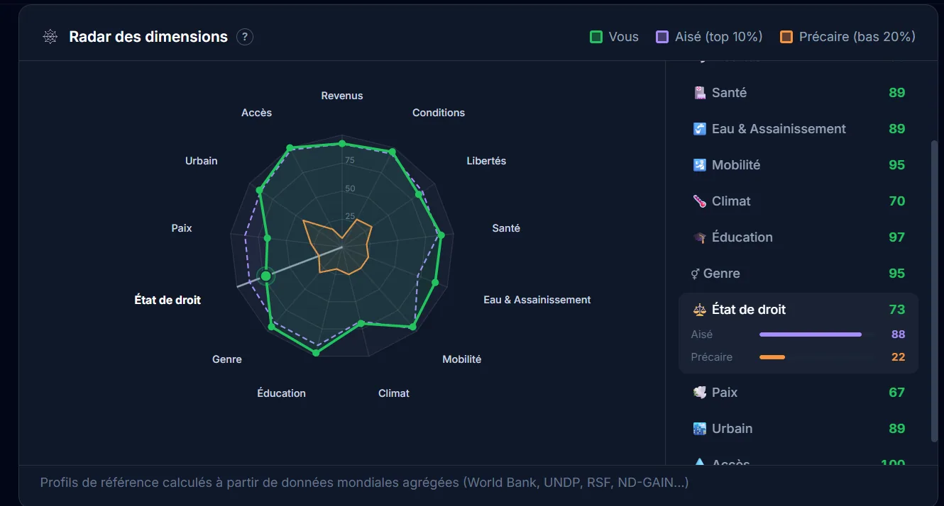
How Am I Lucky, a data visualization of luck
Interactive web app to visualize probability and luck statistics with React, D3.js and Framer Motion.
The project
How Am I Lucky is a platform that lets you compare yourself on about fifty indicators to measure how “lucky” a person is. A kind of compass to see where you stand in the world, through interactive visualizations. There are obviously some methodological biases (especially the choice of indicators), but the result is pretty telling, especially to put things you take for granted back into perspective.
My contributions
Full build: React frontend with D3.js and Recharts visualizations, Framer Motion animations, Express backend, and a Python data pipeline feeding the ~50 indicators. Tests set up with Vitest. The idea was for the data part to evolve without rebuilding the front.
Takeaways
Making statistics speak visually and accessibly remains a real challenge. Combining D3.js and Recharts gives very complementary results: D3 for bespoke stuff, Recharts for standard charts without wasting time. Splitting the Python data pipeline and the React frontend works really well, especially when you don’t want to regenerate data every time.
Context
Personal project. The idea was to make an abstract concept, luck, tangible through concrete data and interactive visualizations. An exercise that obviously has its limits, but works pretty well as a thinking trigger.
App preview
Tech stack
-
React 18 / Vite
-
D3.js / Recharts
-
Framer Motion
-
Express.js
-
Tailwind CSS
-
Python
-
Vitest / Testing Library
Cover image generated by Nano Banana (Google), since I no longer have the mockup template I used before. So it’s not a screenshot of the actual tool.
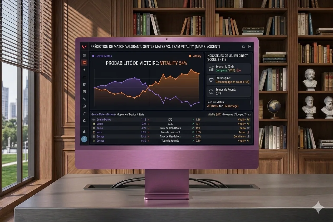
LoL Predict, match prediction via ML
Real-time win probability during a League of Legends match, inspired by esport broadcast overlays.
The project
LoL Predict is a continuation of BestPick, with a slightly different ambition. The idea is to get real-time win probabilities during an ongoing game, kind of like what you see in esport broadcasts. Knowing exactly when a condition flipped, when we just lost something important, that kind of insight. I ended up pausing the project over time, but the concept is still cool, and I may come back to it later with more perspective.
My contributions
Data collector via the Riot Games API (riot_api_client, storage_client), exploratory analysis in Jupyter, and implementation of prediction models.
Takeaways
Applying machine learning to video-game data is fascinating but complex. Real-time data quality and the required volume are real challenges, especially if you don’t have big storage at hand. It’s also a project that taught me to recognize when to pause something, because grinding isn’t always the right strategy.
Context
Personal project, following BestPick. Inspired by the live probability overlays you see in pro esport broadcasts, which are typically the kind of thing that makes you very jealous once you’ve seen them in a stream.
Tech stack
-
Python
-
UV (package manager)
-
Riot Games API
-
Jupyter Notebooks
Cover image generated by Nano Banana (Google), since I no longer have the mockup template I used before. So it’s not a screenshot of the actual tool.
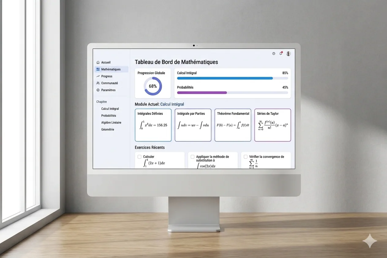
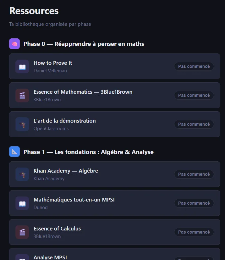
Mathelearning, a math-learning platform
Web app to learn math for Data Science, with user accounts, progress tracking and interactive quizzes.
The project
Mathelearning is a web platform I built to get back into math, with a Data Science angle. It’s at the same time a review app, a platform for structured courses with exercises and progress tracking, and a quiz tool. All under one interface, designed to make learning efficient, and above all, minimally motivating, because getting back into math alone is the kind of thing that quickly slips away if nothing holds the thread.
My contributions
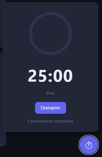
Full design and build: SPA architecture with REST API, user accounts and JWT auth, math formula rendering with KaTeX, per-chapter progress tracking, dashboard, Pomodoro timer, badges system and interactive quizzes. The idea was to have a coherent all-in-one rather than a stack of external tools.
Takeaways
Combining courses, exercises and gamification is really effective for self-motivated learning. It also pushed me deeper on SPA architecture with Node.js and Express, JWT auth, and persistence with sql.js (SQLite embedded in Node), which is a slightly less common approach but works well for a personal project without a dedicated DB server.
Context
Personal project. I needed a structured tool to get back up to speed on math applied to Data Science, and obviously nothing existing really fit. Typical “build it yourself when you know exactly what you want” situation.
Screens
Tech stack
-
Node.js / Express.js
-
SQL.js (SQLite)
-
JWT / bcryptjs
-
KaTeX
-
HTML / CSS / vanilla JavaScript
Cover image generated by Nano Banana (Google), since I no longer have the mockup template I used before. So it’s not a screenshot of the actual tool.
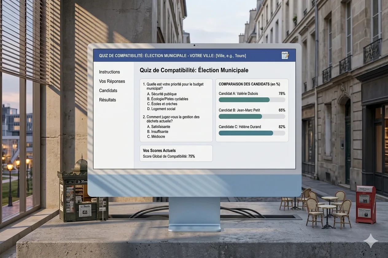
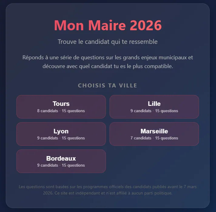
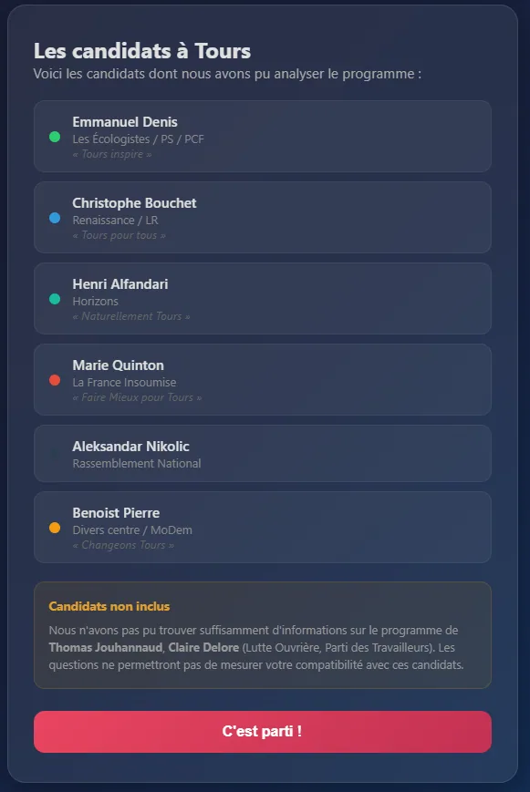
Programme Maire, a compatibility quiz for municipal elections
Web app to measure your compatibility with municipal candidates via a lightweight Q&A based on their programs.
The project
Something I’ve always wanted: know my compatibility rate with different candidates. Tools like that exist for presidentials and legislatives, but never for municipal elections. So I built mine: I collect the candidates’ programs, extract key questions, and the user answers to discover their compatibility with each candidate. There’s obviously a share of interpretation, because municipal positions are rarely very precise, but it’s interesting enough to form an opinion, especially when you don’t know all the candidates in detail.
My contributions
Full design and build: collecting and analyzing programs, Q&A system, compatibility scoring algorithm, and results presentation. The idea was to keep it very direct, especially not to lose the user along the way.
Takeaways
Extracting clear political positions from municipal programs is a real challenge, because many topics stay vague. The scoring system has to be transparent to be credible, which means making the weightings and interpretation choices explicit. And it’s a project that touches civic engagement, which makes it particularly motivating, even if obviously we have to stay humble about the real reach of such a tool.
Context
Personal and civic project, kicked off a bit late for the election (I didn’t have time to ship it publicly on time), but the concept stays relevant and reusable for future deadlines.
Screens
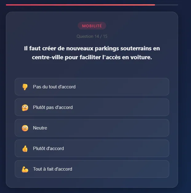
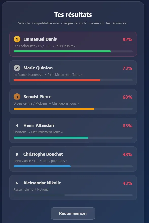
Tech stack
-
Vanilla JavaScript
-
HTML / CSS
-
Local JSON data
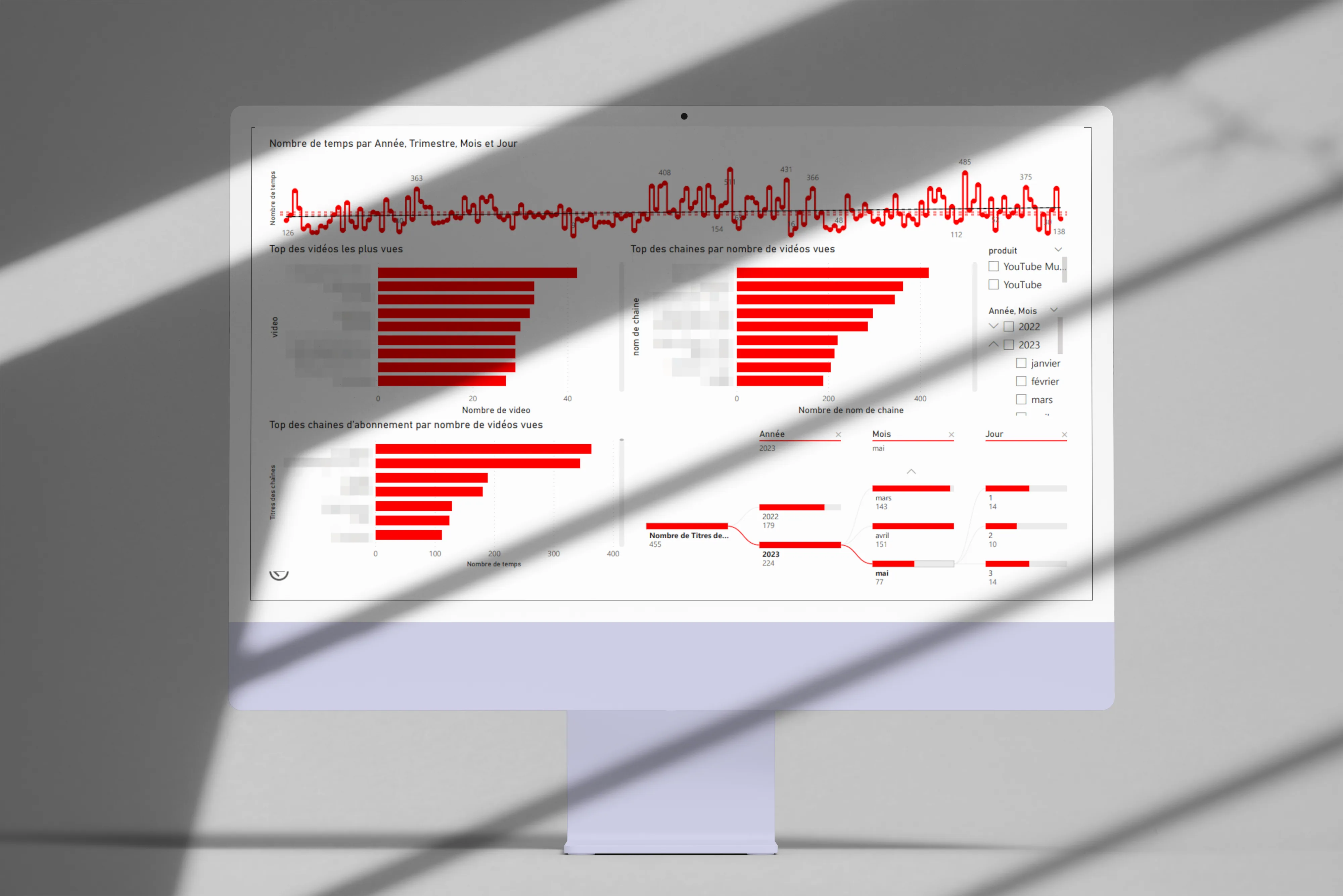
YouTube Data Visualization
Analysis and visualization of my YouTube consumption with PowerBI and Python.
The project
Over the past few months my YouTube consumption has evolved quite a bit. Shorts entered my daily rotation even though I used to avoid them, and that piqued my curiosity pretty fast. So that small curiosity pushed me to analyze my viewing habits to better understand them, especially to check if I was really watching as many Shorts as I felt I was.
The data
I pulled my complete history via Google Takeout, then built a PowerBI app to visualize the consumption data. The idea was to have something interactive, so I could dig as follow-up questions came up.
First visualizations
Here are the angles I explored first:
-
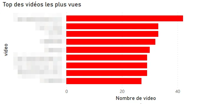
Top channels by videos watched.
-
Top channels I’m subscribed to.
-
Most-watched videos.
-
Time split (year, quarter, month, day).
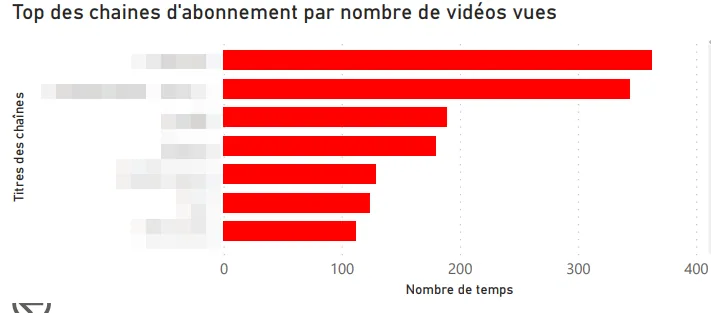
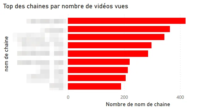
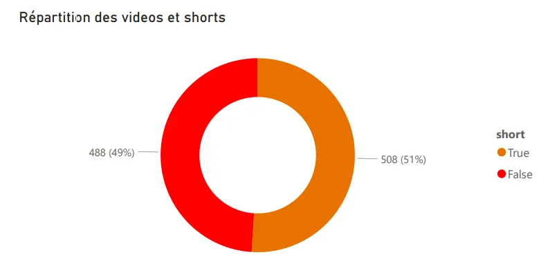
Shorts vs classic videos
First catch: YouTube doesn’t distinguish Shorts from regular videos in the exported data. Digging, I found that Shorts URLs contain a /shorts/[id] path, which let me identify them and build a dedicated split visualization. Not the most elegant technique, but it does the job.
Other visualizations
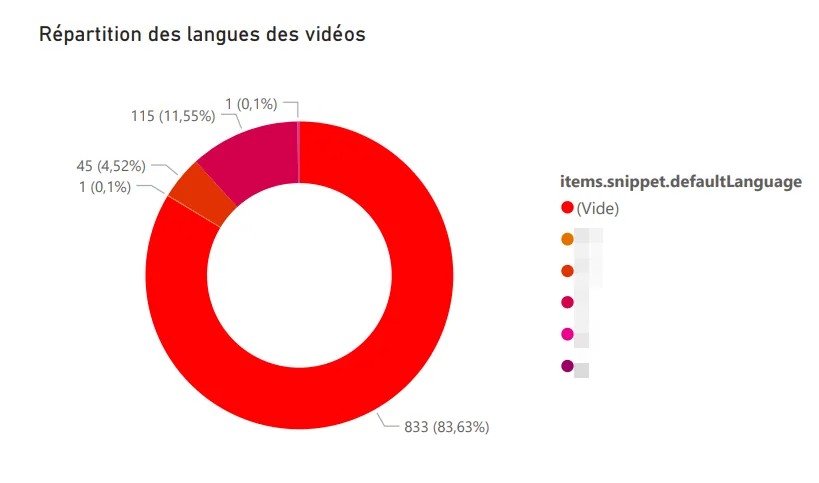
Language distribution. Reusing the logic from my Any%English project, I identified the language of each watched video: French, English, German, Japanese (probably the Shorts, by the way).
Word cloud. Generated from the descriptions of watched videos, it surfaces my recurring themes: music, video games, travel. Nothing very surprising, but still nice to have it quantified.
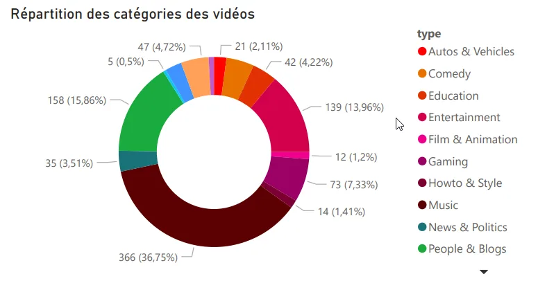
Top categories watched. Music, video games, and entertainment lead the pack.
Motivations
This project answered a real personal question about my digital habits, and at the same time it let me level up on PowerBI, which I knew less well than Tableau Software. A double benefit, which is always pleasant on a personal project.
Tech stack
-
PowerBI
-
Python
-
YouTube Data API v3
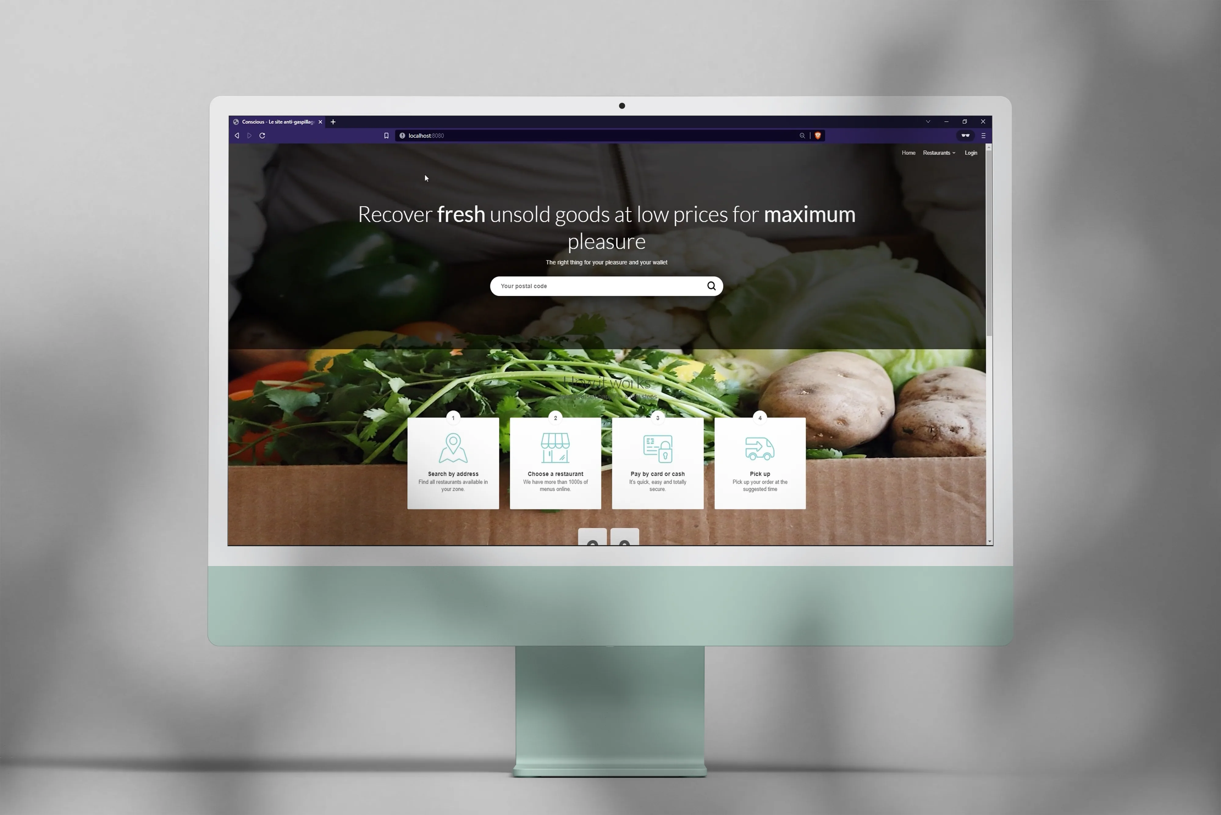
Conscious, an anti-food-waste web app
Web app for selling anti-waste meal baskets, built as a team with Spring Boot.
The project
As part of my 3rd-year Computer Science bachelor’s, we built a web app for selling meal baskets to fight food waste. It’s a topic we cared about, and it made for a school project that felt more concrete than usual, which meant the team was pretty motivated.
In a team of three students, we followed an Agile (Scrum) workflow where each member explored the whole chain, from design to development. The idea was for everyone to get more versatile, especially so we wouldn’t be stuck if someone was missing.
My contributions
-
Project organization and tracking.
-
Admin area and homepage development.
-
Mockups and visual assets.
Takeaways
We shipped on time, even though our urge to explore ambitious technical features cost us time. This project taught me a lot about team management, prioritization, and how the web works through Spring Boot. Obviously, we could have been more reasonable on scope upfront, but that’s typically a lesson you only learn by running into it.
Context
Project done as part of the Computer Science bachelor’s at the University of Tours.
Tech stack
-
Spring Boot / Java EE
-
JPA / Hibernate
-
MySQL
-
jQuery / Bootstrap 4
-
Maven / Git
Opinion Mining, sentiment analysis on text
Exploring sentiment analysis on tweets and texts with Python and Orange DataMining.
The project
This university project aimed to answer two fairly fundamental questions: what is sentiment analysis, and how can we actually apply it? It’s the kind of subject that looks simple said like that, but gets much more subtle the moment you look at a real corpus.
Use case 1, tweets from presidential candidates
Using the Twitter API, I pulled the last 4,000 tweets of several candidates to analyze the tone of their communication: positive, negative or neutral. The idea was to see whether you can characterize a campaign stance just from the emotional charge of tweets.
Use case 2, tweets about Ukraine after the invasion
Using Orange DataMining and its Twitter integration, I analyzed the overall sentiment of tweets published about the Ukrainian conflict in the days following the start of the invasion. Obviously it’s a heavy subject, and the results need to be taken with a lot of caution, especially because automated analysis handles irony and pain poorly.
Use case 3, analyzing a webtoon
I ran the algorithm on the texts of the Eleceed webtoon to extract the main characters and analyze the sentiments attached to dialogues. Results were uneven depending on sentence complexity, so it wasn’t really actionable, but the experience was rich in lessons about the model’s limits.
Takeaways
Opinion mining is a technique for extracting and classifying opinions from text, useful especially for trend-following and behavior prediction. Results aren’t always directly actionable, obviously, but they offer an interesting read on opinion dynamics, so it’s something you can integrate with other signals rather than rely on alone.
Context
Project done as part of the Computer Science bachelor’s at the University of Tours.
Tech stack
-
Python
-
Orange DataMining
-
Tableau Software
-
Twitter API
Legermain, a showcase site for a craftsman
Showcase site built with Symfony for a fictional craftsman, as part of the Computer Science bachelor's.
The project
As part of my 3rd-year Computer Science bachelor’s, we built a showcase site for a fictional craftsman. The goal was to design and develop a full portfolio that showcases the client’s business, with the constraint of using the Symfony framework. Classic class assignment: looks simple, becomes interesting the moment you take it seriously.
In a team of 5 students, we worked Agile style over 3 months, at 2 to 4 hours a week. Every member covered the whole chain, from design to deployment, so nobody was fully locked into a single role.
My contributions
-
Team organization and project management.
-
Graphic mockups and visual assets.
-
Development of the Work, Dashboard and admin pages.
-
TWIG extensions (sharing, etc.).
-
Deployment on my own server.
Takeaways
We shipped on time despite our taste for technical exploration, which was obviously not a given. The project taught me a lot about team management and how the web works through Symfony, especially around templates and code organization.
Context
Project done as part of the Computer Science bachelor’s at the University of Tours.
Tech stack
-
Symfony / PHP / JavaScript
-
Adobe XD, Photoshop, Illustrator
GetSubscribedChannels, a YouTube channels exporter
Python script to fetch the profile pictures of my subscribed YouTube channels via the YouTube Data API v3.
The project
A friend of mine suggested doing a tier list of our favorite YouTubers to swap recommendations. The catch: none of the templates on Tiermaker had all my channels. So, instead of adding them one by one by hand (which would have taken forever for a mediocre result), I adapted the code from my Any%English project to automate pulling each channel’s image.
How it works
-
Export my subscriptions from Google Takeout.
-
Read the CSV file with the channel IDs.
-
Hit the YouTube Data API v3 to fetch each channel’s image.
-
Download the images for the Tiermaker template.
Simple, quick, effective. Typical micro-tool you code in a single evening and end up reusing more often than you’d expect.
Context
Personal project, born of a concrete need in a few hours.
Tech stack
-
Python
-
Requests / Pandas
-
YouTube Data API v3
Any%English, how much of my YouTube is in English?
Python script to compute the share of my YouTube views in English via the YouTube Data API v3.
The project
A question had been nagging at me for a while: since I started using YouTube, what percentage of my videos have I watched in English? A bit of a silly question, sure, but one I thought would be a good proxy for my daily exposure to the language.
After checking the YouTube API, the catch was that the v3 only returns 50 history items at a time. Not enough for my consumption, so I had to get creative.
The solution
-
Export full history via Google Takeout.
-
Load and process with Pandas.
-
Send video IDs in batches of 50 to the YouTube Data API v3.
-
Pull the
defaultAudioLanguagefor each video. -
Compute the final ratio.
Result
On my last 16,000 videos: 53% in French, the rest mostly English. More balanced than I thought, since my gut feeling was closer to 70/30 in favour of English.
Context
Personal project, born of a simple curiosity about my digital habits.
Tech stack
-
Python
-
Scrapy / Pandas
-
YouTube Data API v3
DofusClassSelector, a ladder analysis for Dofus
Scraping bot to find the least-played classes in the Dofus Kolizéum ladder.
The project
Getting back into the MMORPG Dofus, I had to pick my class. Instead of going with a popular one, I wanted to play a class that’s rarely represented among the best players. A slightly counter-intuitive choice, sure, but it makes progression more fun, mostly because every matchup is less repetitive.
So I built a bot that scrapes the Kolizéum ladder (the top solo players ranking) and analyzes class distribution to identify the rarest ones.
Takeaways
This was my first contact with web scraping and tabular data handling. A genuinely formative experience that made me want to keep going on data. Directly triggered several later projects.
Context
Personal project, done out of curiosity and for a practical use.
Tech stack
-
Python
-
Selenium (scraping)
-
Pandas (data analysis)
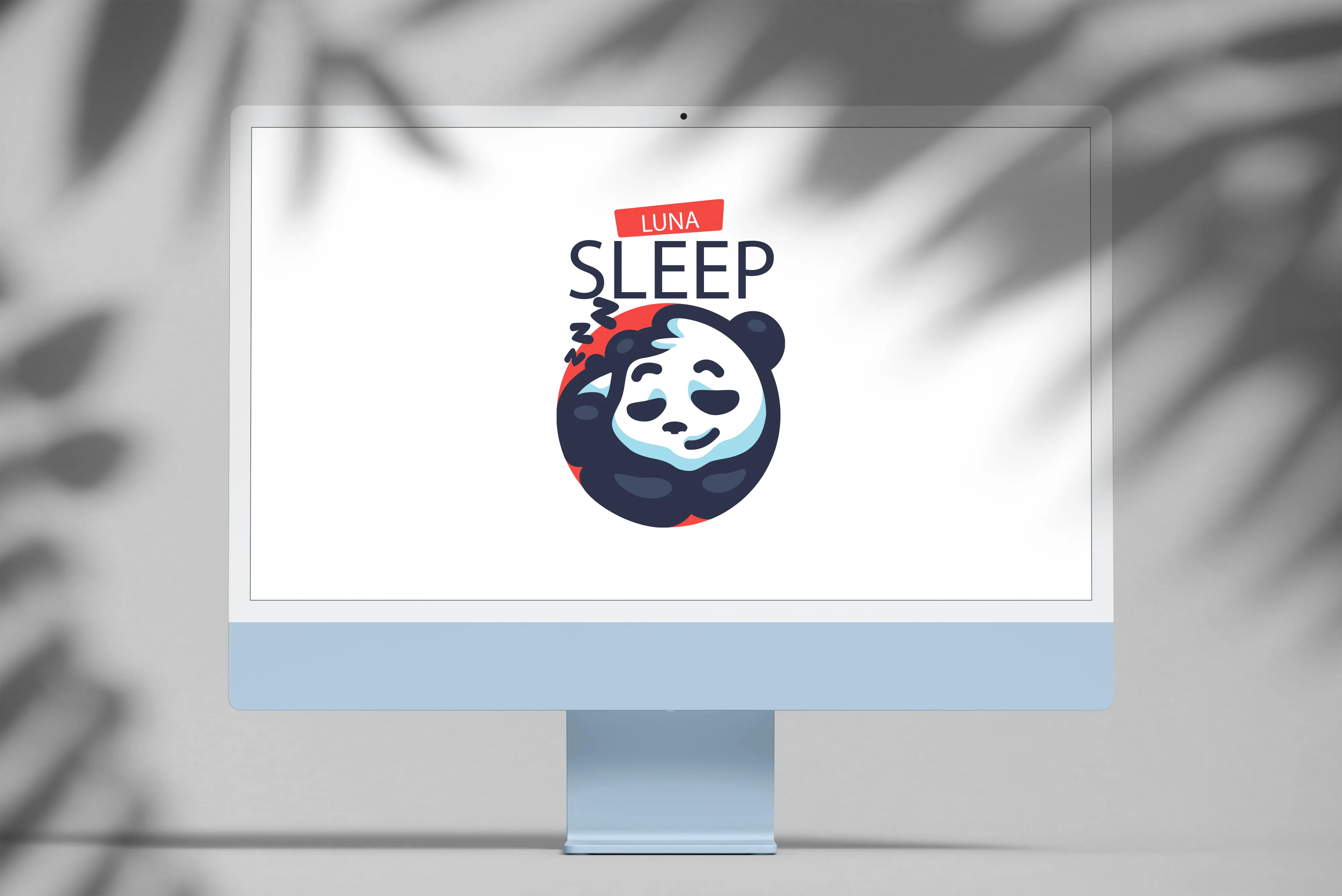
LunaSleep, does the moon affect my sleep quality?
Correlation analysis between moon phases and my sleep quality, via the Withings API.
The project
As a data and home-automation enthusiast, I wanted to combine both to test a hypothesis my parents have always brought up: the moon affects sleep quality. It’s something I’ve been hearing forever, and rather than accepting or rejecting it without proof, I decided to check it on my own data.
The data
For months I’ve been using a Withings sleep sensor that scores my nights. Combined with moon phases, the goal was to see if there’s an observable correlation, even if obviously we should be careful because the data volume is limited.
Takeaways
The project pushed me on using Python APIs and handling time series with Pandas, which served me later on other personal analyses.
The project is ongoing. Results will be posted here when available.
Context
Personal project, driven by curiosity and self-tracking.
Tech stack
-
Python
-
Withings API
-
Pandas
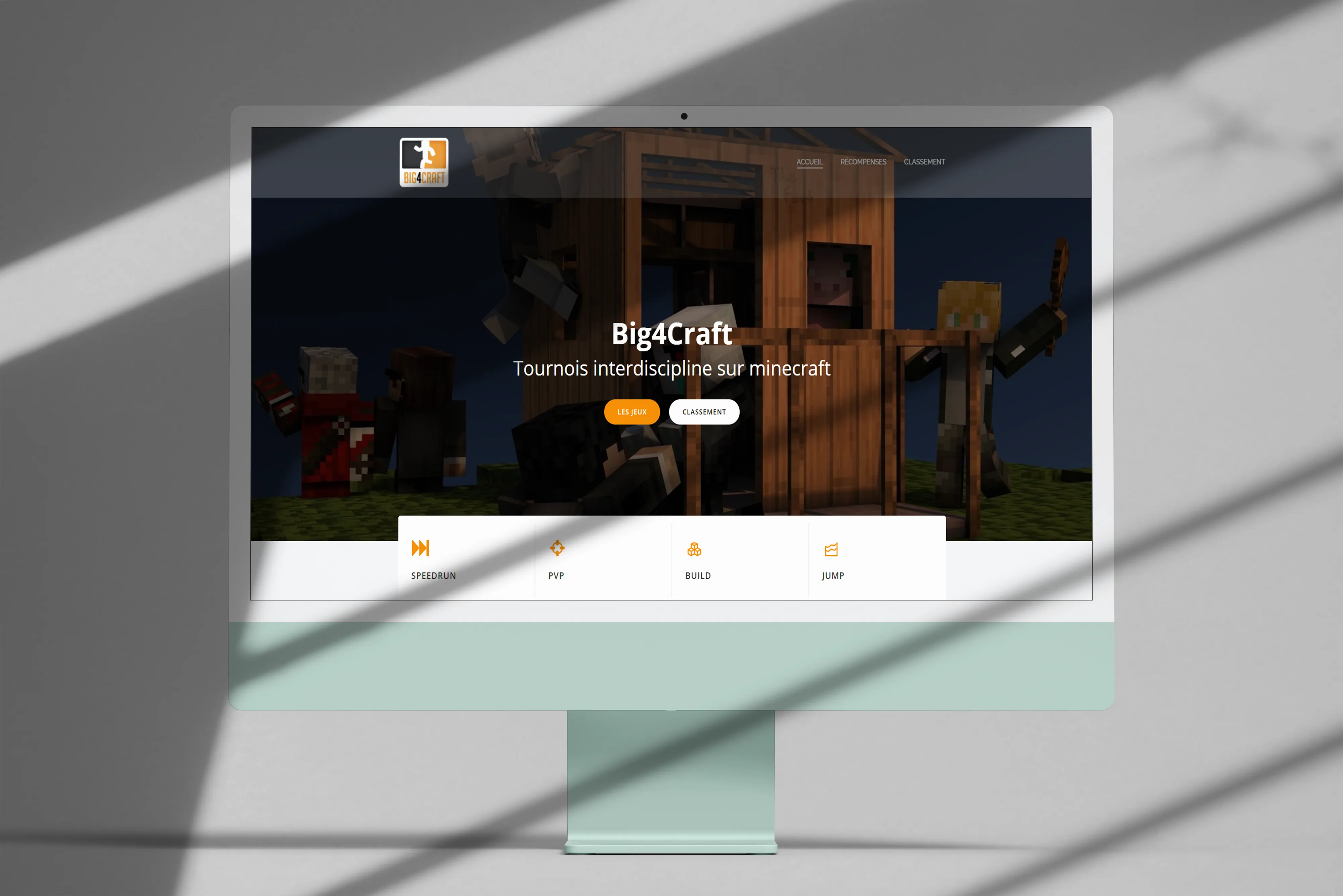
Big4Craft, a last-minute Minecraft tournament site
Web platform built in a few hours to run a Minecraft tournament among friends.
The project
Part of a multi-gaming Discord server among friends, we ran a Minecraft tournament. To centralize the challenge info and make it accessible to every participant, I threw together a simple, fast web platform. The idea was that everyone could find the essentials in one place, without scrolling through a two-week-old Discord message.
What got built
-
Graphic and text content.
-
Site setup and configuration.
-
Live in a few hours.
Context
Community project, done for a small group of players. Typical “give a hand when you have the tools” kind of thing, and it made the event feel a lot more polished.
Tech stack
- WordPress (Colibri template + extensions)
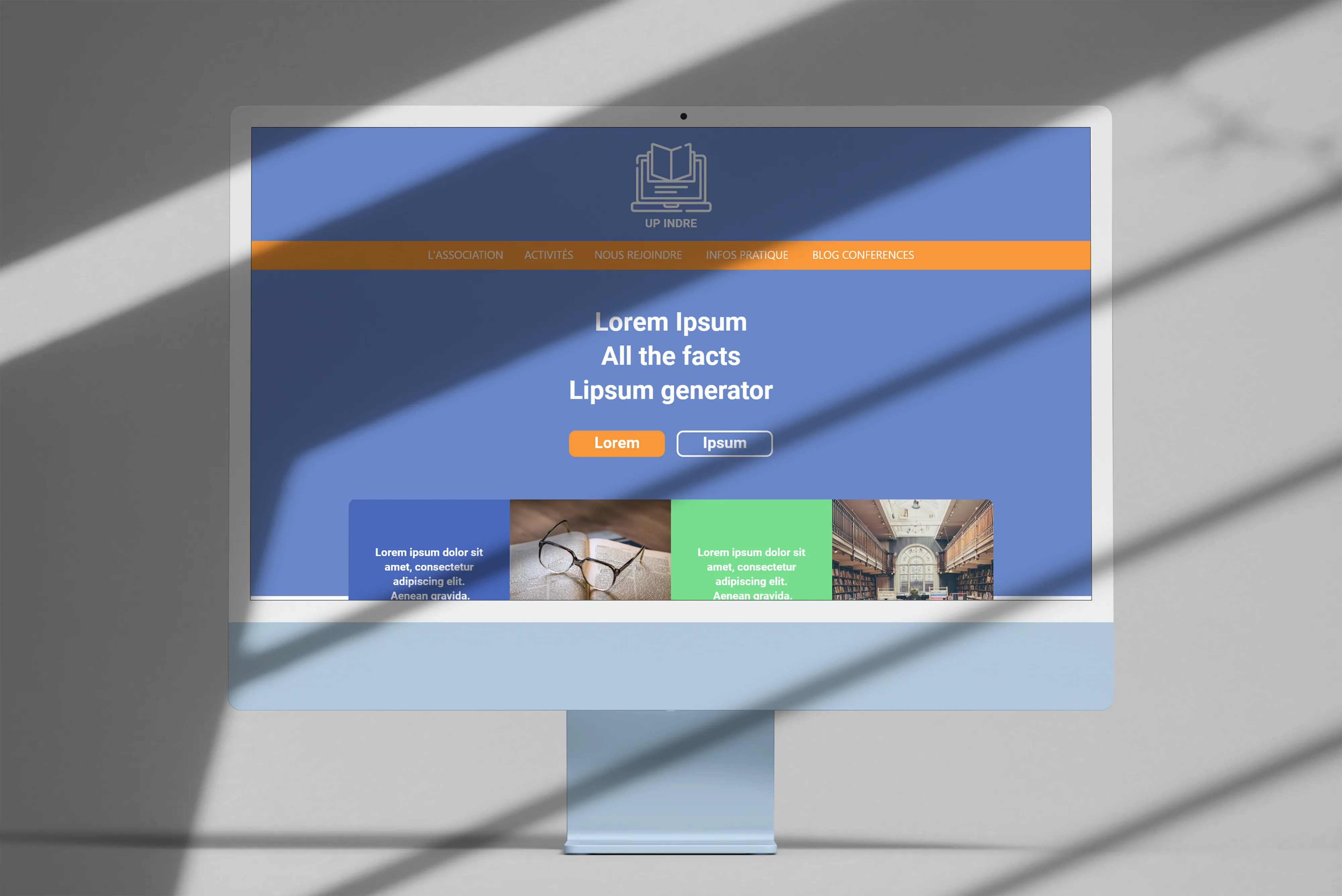
Université Populaire de l'Indre, an online course platform
Design and integration of a web platform to digitize courses, schedules and payments.
The project
Hired to build the website for the Université Populaire de l’Indre, I worked in a pair with another junior developer on a fairly ambitious platform: digitizing the courses, schedules and payments of the association. Typical kind of job that looks simple on paper, then reveals tons of edge cases in use.
My contributions
-
Graphic exploration and art direction.
-
Mockups.
-
Frontend integration.
We wrapped a working beta. The project stopped early after the contract ended, so it didn’t go through to full production.
Context
Freelance gig for the Université Populaire de l’Indre.
Tech stack
-
PHP (no framework)
-
JavaScript
-
CSS
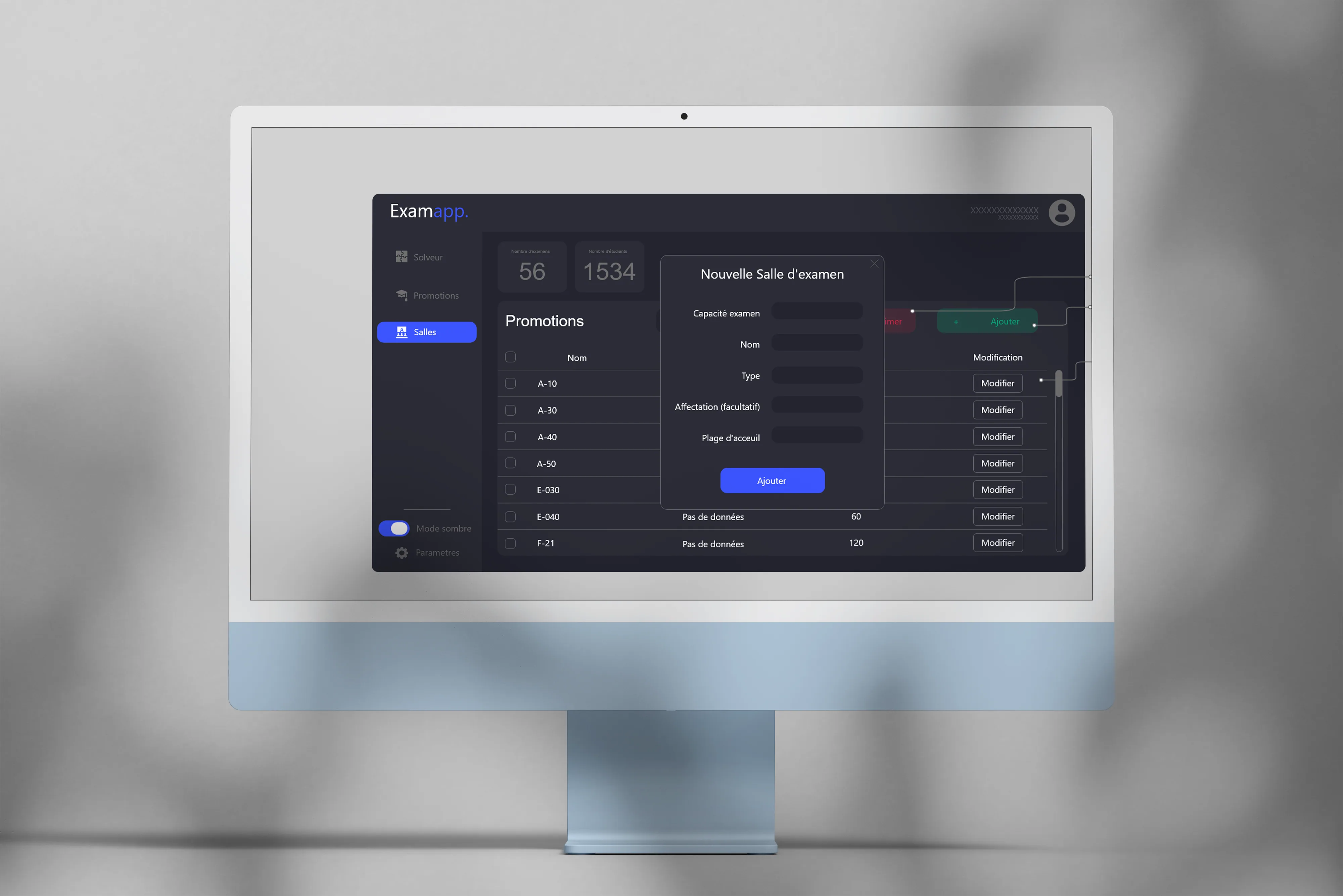
ExamApp, university exam scheduling
Java app to help the University of Tours registrar schedule exams, powered by an Optaplanner constraint solver.
The project
As part of my 2nd-year Computer Science bachelor’s, we built an app to help the registrar schedule exams while respecting many constraints (rooms, availabilities, groups, etc.). Easy to state, but actually pretty tricky to solve cleanly.
In a team of 5 students, we set up a collaborative workflow with clear role-splitting. The idea was for everyone to own a scope without losing the big picture.
My contributions
-
Team organization and project management.
-
Graphic mockups.
-
Constraint solver development with Optaplanner.
Takeaways
This project taught me a lot about teamwork and resource management. It also made me aware of some of my own leadership limits at the time, which is always a little uncomfortable to admit, but useful for what comes after. We still shipped a working version on time.
Context
University project for the University of Tours registrar.
Tech stack
-
Java
-
Optaplanner (constraint solver)
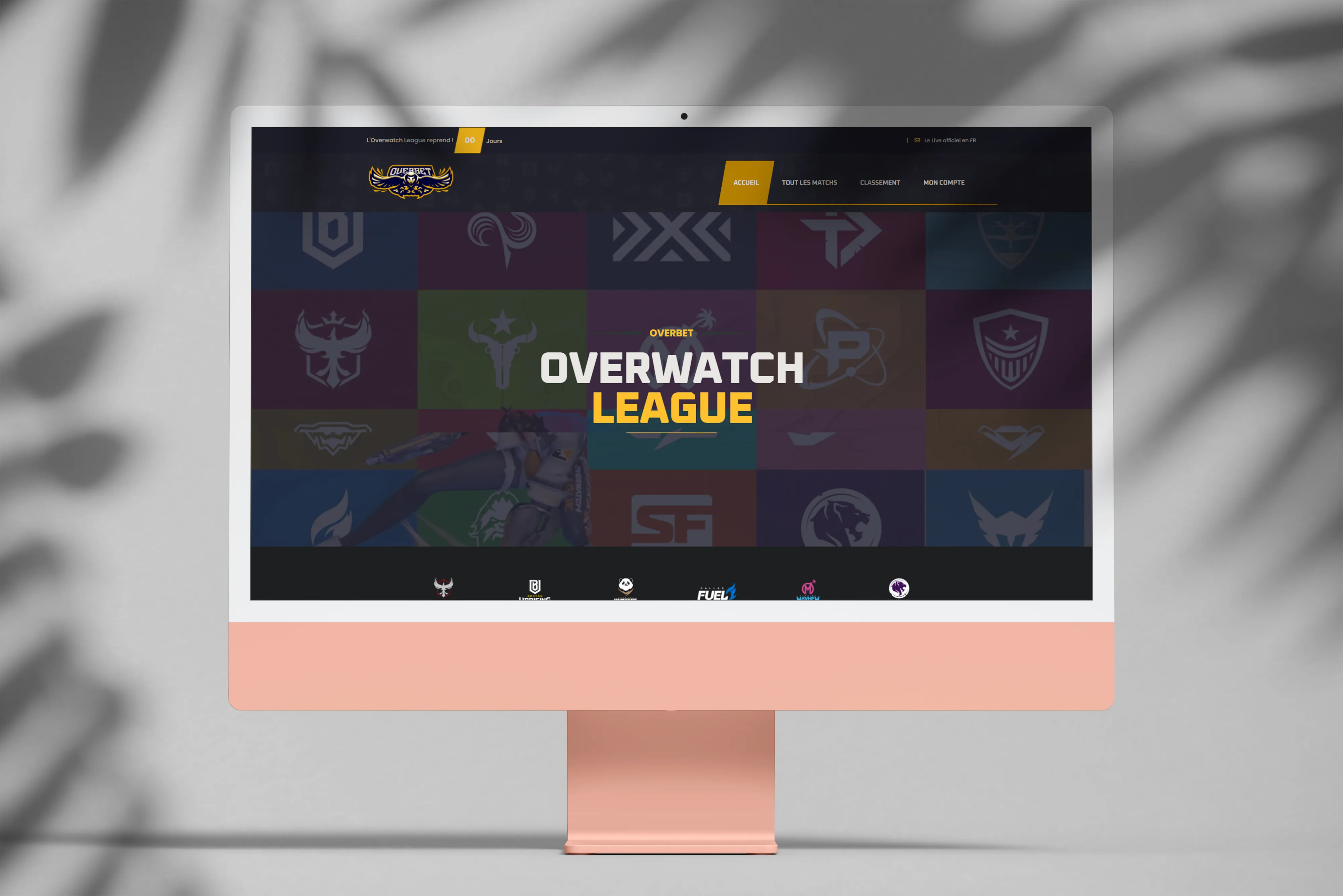
Overbet, friendly bets on Overwatch esport
Friendly betting web app around the Overwatch League, built in two versions.
The project
Overbet comes from a time when I was deep into the Overwatch esport community. With friends we were already placing bets on Overwatch League matches, and I wanted to build a proper graphical interface with a scoring and ranking system so everyone could join in. The goal was to move from a shaky Excel file to something cleaner and shareable.
The project evolved through two versions.
Version 1
A technical prototype to try out APIs and databases in PHP from scratch, minimal dark-themed design. No longer online.
Version 2
A redesign with a more polished look, more features, and cleaner code. The project was finished and usable, but right when I wrapped it up, the Overwatch League launched its own betting platform, which pretty much killed my motivation to keep going.
Takeaways
Timing is crucial. A project can be technically sound and lose its point if the official platform ships the same thing. It also taught me a lot about PHP development, database handling, and refactoring between versions. In particular, it’s often better to throw a prototype away and rebuild than to let it live when it wasn’t designed to last.
Context
Personal project, built to liven up esport nights among friends.
Tech stack
-
PHP (no framework)
-
JavaScript
-
MySQL
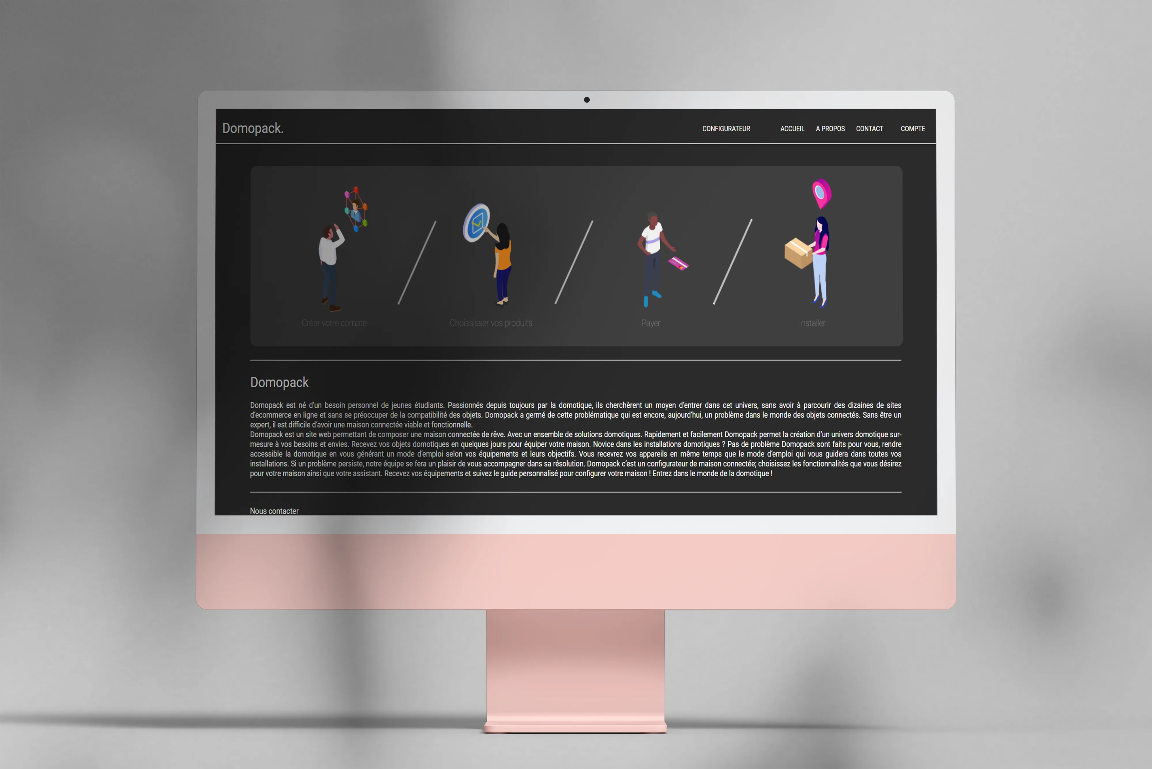
Domopack, a connected-home configurator
Web app to configure a smart home, inspired by PC and car configurators.
The project
Domopack is a web service to build your smart home by picking home-automation solutions à la carte, a bit like a PC or car configurator. The idea had been bouncing around in my head for months, so this 1st-year bachelor’s project gave me the chance to put it on the map technically.
My contributions
-
Graphic mockup.
-
Configurator development.
-
Site pages.
Takeaways
This was my first team build on web development, and I loved it. We shipped a stable, secured final version on time, which was obviously far from a sure thing in first year.
Context
University project (1st year of bachelor’s), and at the same time a test of a startup idea I was kicking around.
Tech stack
-
PHP (no framework)
-
JavaScript / jQuery
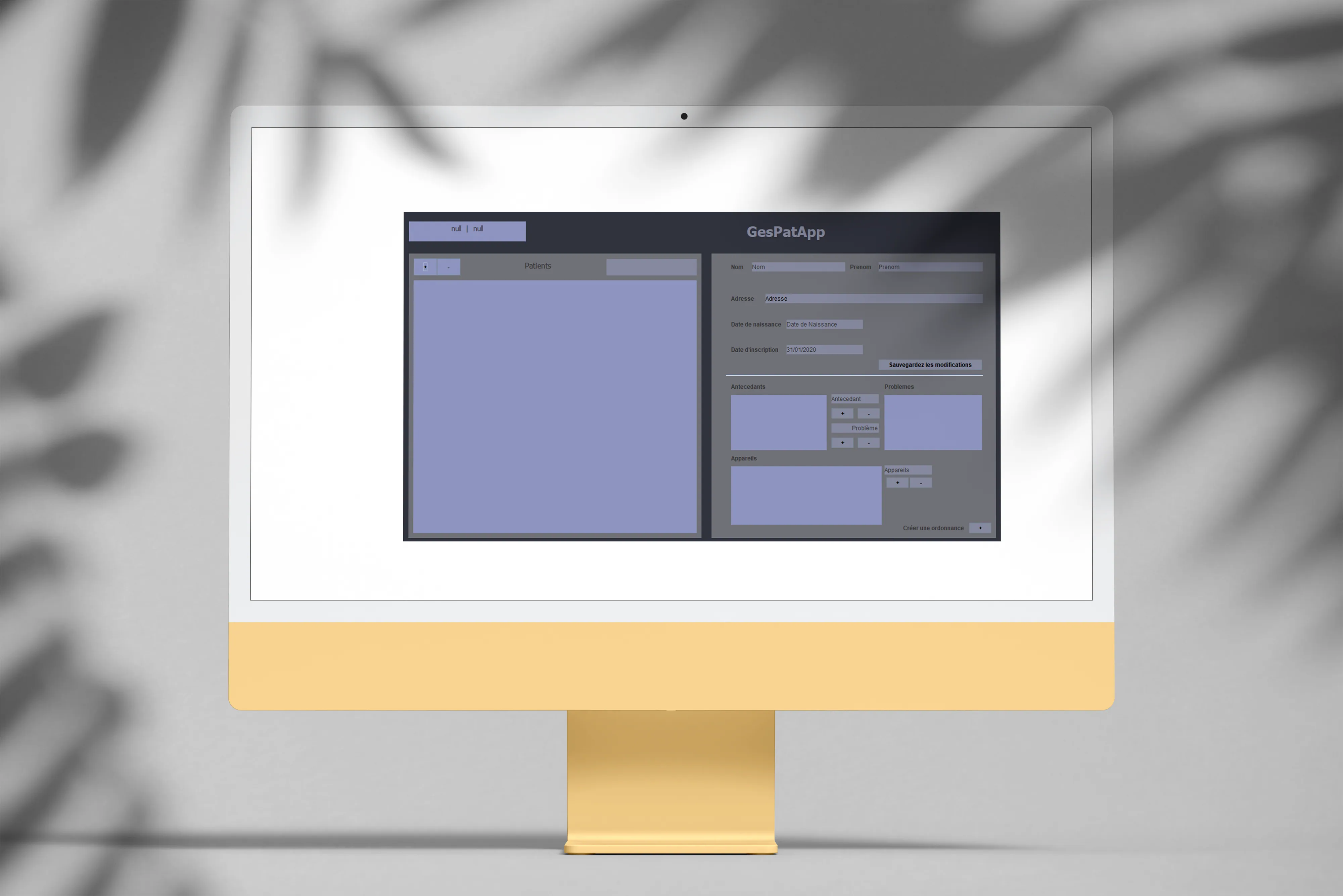
GesPatApp, managing a health center in Java
Java application to manage a health center, my very first team dev project.
The project
As part of my 1st-year Computer Science bachelor’s, we built a health-center management app in Java, with no database: everything was stored in files. A somewhat old-school constraint, but it forces you to understand what’s happening under the hood of persistence, especially when you’re hand-writing serialization.
In pairs, we covered the whole development cycle.
My contributions
-
Interface graphic mockup.
-
File-based storage system.
-
Core features (patients, appointments, etc.).
-
Mockup integration into the app.
Takeaways
This was my very first dev project, on top of that in a team. Despite the inexperience, we shipped a working piece of software on time, which was a real source of pride.
Context
University project for the University of Tours.
Tech stack
- Java (Vanilla)
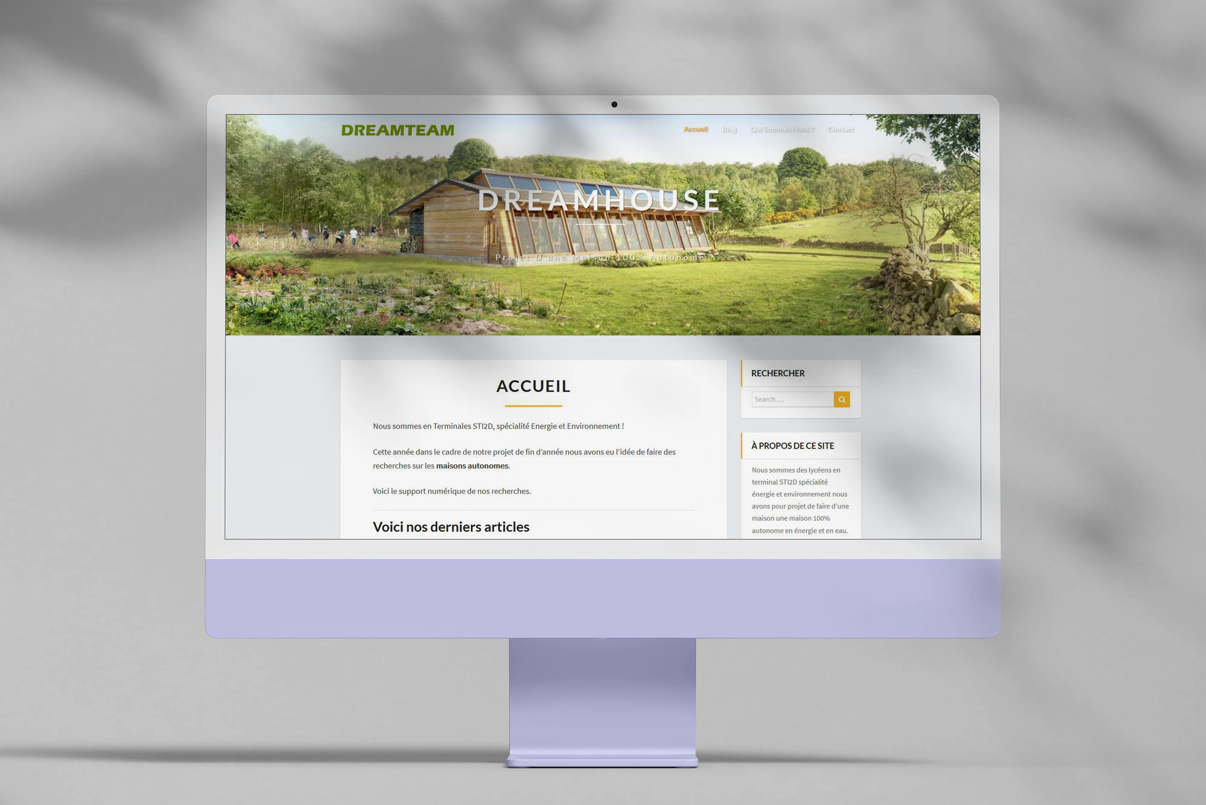
DreamTeam, a final-year project logbook
WordPress site built to track and document a STI2D final-year project.
The project
As part of my STI2D high-school program, I set up a website as a logbook to document the progress of our final-year project and share it with the examiners. It’s kind of the first real personal project where I had to keep something running over time.
Context
STI2D final-year project, meaning the first website I built in a school context, and more broadly, one of the first ever.
Tech stack
- WordPress
Click to open an app
Let's talk
Got a signal to dig up?
A data project to scope, a dataset to explore, an open question. I read every message.